17 December 2007

Merry Christmas

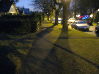
I took a walk at night with my Canon G9 and got some interesting photos of Christmas lights, etc. I'm not thrilled with the image quality of the G9 as compared to my 5D, but it's not bad for something I can just toss in my purse and take with me anywhere I go. And this photo was shot after dark (the sky looks way more blue in the photo than it did in real life; the camera figured out it needed a long exposure). It's pretty grainy and blurry (handheld, of course) but I kind of like the effect. No Photoshop sharpening at all.

I'll be taking a hiatus for the next couple of weeks, through the New Year. See you when I get back.

07 December 2007

Narrative Photography

Update: fixed the link for Jeff Wall's Mimic, so if you read this already but couldn't see the photo, try now.

I've just signed up for a course on Narrative Photography at Focal Point, the photography school a block away from where I live (one of the reasons I moved to this house). Narrative Photography includes photojournalism, documentary photography, some kinds of travel photography. It's photography that tells a story, whether in a single photograph or a photo essay.

I was in Future Shop yesterday buying a small portable camera to keep with me in my purse all the time. I ended up buying a Canon PowerShot G9, after reading Paul Butzi's glowing recommendation. I had a pleasant experience with the salesman, Rick, who helped me. He is an avid photographer himself and was very knowledgeable and engaging (rare for Future Shop employees). We had a great conversation, exchanged recommendations for good photography websites, etc. He asked me who my favorite photographer is. I said Art Wolfe, a Seattleite who does beautiful nature and wildlife photos, particularly of the Pacific Northwest. Rick called that kind of work "eye candy" and introduced me to narrative photographer Jeff Wall, a Vancouver native who does "cinematic photography." He develops a concept, hires actors, sets up a scene, and takes thousands of shots of it until he gets it just right. Rick showed me some of Wall's work on the web at the store's computer. Wow! Check out this amazing photograph of his: Mimic. Look closely at the gesture the guy in the middle is making (view it in detail by clicking on the detail sqaure to the right). And the facial expressions on the other two. Now that is photography that tells a story!

I realize that most of my photos do not really tell stories, beyond just "this looks cool!" I hope the class on narrative photography will help me advance to a whole new level in my art. Today's photo is an attempt at narrative. The photo tells it all, but if you want the details behind it: It was taken on the property of my cousin in Hood River, Oregon, where I spent Thanksgiving this year. There had been a big wildfire Hood River in August and it came to within about 60 feet of my cousin's house!

Speaking of narrative photography, one of the more lengthy and interesting threads on photo.net's Forums is "Should a Picture tell a story?" Not all are in agreement about that.

03 December 2007

Rusty spokes

Rusty old car wheels in front of the Western Antique Aeroplane & Automobile Museum in Hood River, Oregon. I did some burning in Photoshop to darken the topmost element wherever spokes and wheel parts intersected, to make them look more three-dimensional.

29 November 2007

New Toy: Epson P-5000 Multimedia Storage Viewer

Sorry for the sparsity of posts lately. I've been trying to get an article finished which is overdue.

I didn't think I'd ever use this blog to do product reviews, but I like this one so much I can't help it. I recently purchased a new solution to the problem of not being able to take my laptop along with me in addition to my camera on long trips anymore. (I was forced to check my camera bag on a flight from London to Milan because of Heathrow's extremely narrow interpretation of the "one carry-on bag" rule; even a woman's small purse counts as a carry-on bag in their eyes; it was either check my camera or check my laptop; some choice!) Anyway, now I have this cool Epson P-5000 Multimedia Storage Viewer. The image quality is great, the 4-inch display is large enough to really see the photos, and the user interface is intuitive and easily accessible. It accepts CF or SD cards, copies the contents onto its internal hard disk (which stores 80 GB), and can connect via USB to a computer (where it will appear as an external hard disk). It also plays back MP3s and video using its little built-in speaker (zoom buttons control volume). A nifty little device. Much better than the SmartDisk FlashTrax XT that I'd been using before. The latter is excruciatingly slow, has a crappy UI, very poor image quality, and intermittently doesn't work at all.

That photo I'm displaying on my Epson P-5000, by the way, is one I took recently out on Galiano Island, the view from Hunterston Farm out over Retreat Cove, with the celtic cross on Loren & Mary Ruth Wilkinson's lawn in the foreground.

17 November 2007

[Italy trip] Prayer

Old monk praying during the Vesper service at San Miniato al Monte, in Florence.

20 October 2007

[Italy trip] Conventional conventical technology

I liked this wooden cart which I saw on the grounds of Villa Agape where we stayed in Florence, which is run by the Sisters of "Stabilite nella Carità" (stability in charity). Simple technology, elegant and rustic at the same time. Interesting shapes and textures. I did quite a bit of Photoshopping on this, as there were some distracting blotches of lighter color on the handle near the rusty metal joint which immediately drew one's focus and ruined the composition (in my opinion). I think I did a pretty good job of cloning the wood grain where those spots had been, in a way that doesn't look faked. This is Photoshop at its best -- used to fix something which was not a photographer's error, yet without violating the true nature of the original subject. (That gives a lot of latitude, by the way, to adjust colors, etc. And there is always validity in creatively changing the subject. So don't quote that line back at me if you see something more wild in my use of Photoshop in the future.)

13 October 2007

Destroying restored art vs. restoring destroyed art

More reflections from my art tour of Florence. This 14th or 15th century fresco in San Miniato al Monte (Florence) looks like it has probably had some restoration work done on it over the years, as its colors are so well preserved (I have not touched them up in Photoshop). But also preserved for all eternity (until someone decides to do another restoration on it) are the graffiti of some 20th century vandals (in the lower right corner, on the red patches; click to zoom in on image). It appals me that anybody could be so philistine as to ruin art in a sacred space like this. Fortunately, at not very great expense (certainly not like what it would cost to repair the actual fresco), I can fix the damage pretty well in Photoshop. This illustrates the non-destructive restoration possible in digital media. I can keep a copy of the original, just in case someone doesn't like the kind of touching up I did.

Not so with non-digital art. Case in point: the famous Crucifix by Cimabue, painted to hang above the altar in Santa Croce in Florence. It had been lingering in storage, leaning up against a wall in the refectory, after renovations had replaced it with some other piece. Then it was almost completely destroyed in the great 1966 flood of the Arno River. The controversial restoration by Umberto Baldini used a new technique in which areas where the paint had been completely washed off are approximated with a pixel pattern that only suggests the color and outline of what was there before, but does not recreate brush strokes. Baldini and his team "felt strongly that it was inappropriate to leave this extremely important work as a mere fragment, and yet they were unwilling to deceive the viewer into thinking that the work was undamaged. Chromatic abstraction was their answer to this dilemma. Chromatic abstraction is formulated on the idea that three dominant tones can be abstracted from any painting. These colors, combined in the losses in small strokes that follow the dynamic flow of the image, and in the correct proportions, create the neutral color that blends most perfectly with the painting, making the losses the least distracting without inpainting them imitatively." (Getty Conservation Institute, Painted Wood: History and Conservation, p. 414.) You can see this clearly in the detail of Christ's feet (below, right; click to zoom in on image). Some people have objected to Baldini's restoration because it is not Cimabue's work at all. They claim that the ravages of time and natural disasters are part of the history of art that should be preserved. I am still undecided on this issue. I can't say I liked the restored Crucifix. But it is intriguing from an art historical point of view. You can read more about the restoration debate in this article, and (if you have JSTOR access) in "Art and Its Preservation" by David Carrier (Journal of Aesthetics and Art Criticism 43:3 (Spring 1985), pp. 291-300).

With digital art (including digital photography), all of this is moot. The original cannot become degraded over time, or destroyed by a flood or fire, nor can it be vandalized, as long as a backup is made. And as long as it is converted to new media as they are invented and the old ones become obsolete! That latter would be a subject for "a whole 'nother" post (my favorite example of tmesis, a figure of speech in which a word or phrase is inserted into another word, often for humorous effect).

11 October 2007

The golden lampstand

[News flash: This photo of mine has been published online in Comment Magazine. Click here.]

"Aaron is responsible for keeping the lamps burning continually on the Lampstand of pure gold before GOD." (Lev 24:4; The Message)

Here is another in my votive candles series (see also this one). It is a portrait of a serious man of God, at work in the house of the Lord. This is one of the monks at San Miniato al Monte in Florence, lighting additional candles before the Vespers service. I was drawn to the glow on his face, and only later noticed the subtle outline highlight on his hair from a bit of sun coming in the window above his head. Without that, his head would have blended into the dark background. I considered whether to crop more of the black space at the bottom, but I decided to keep it, to emphasize the height of his body. You can see his robe disappearing into darkness and can imagine where it extends to.

Another possible composition crops it in way close and reveals the time on his watch (even though I was standing about 30 feet away from him; see, there is a use for 12.8 megapixels!) -- the Vespers service did indeed start at 5:30pm. You'll need to click to view the image at full size to be able to read it. For you techies who are interested, this was shot with a 70mm lens, ISO 1600, f/4 at 1/125. Hand held, no flash. ISO 1600 on my Canon 5D rocks! It was very dark in there. I'm beginning to think I like this second one better. What do you think?

05 October 2007

Where is the frame of this picture?

Frame-within-a-frame is a motif that shows up in all kinds of art, from René Magritte to Norman Rockwell to Alfred Hitchcock's films to the Frame Within a Frame group at Flickr. I visited Siena for a day and took lots of photos of all the beautiful architecture and art, just for my own memory. Boring. Well, you might want to see them and they might cause you extreme envy, but I can't claim they are my own artistic creations. However, when I deviated from the usual touristic camera behavior and started looking for the offbeat and quirky, which I guess is where my forte lies, I found this fun subject walking right across my field of view. I like it because though I've chosen to frame it in a certain way, the frame the man is holding makes its own declaration about what is the subject of the picture -- the man's legs and the bag of the lady behind him. Because he's holding two frames (which, incidentally, make a nice repeated shape), the people on either side of him got that experience (though I with my camera could only see one of those views).

04 October 2007

Portraits of children

Yeah, I know this photo isn't exactly about the culture of Italy, but I did take it while I was over there. My little Italian cousins have provided wonderful subjects for me to photograph (see also this one from Milan last year), perhaps because they can't communicate with me and yet are fascinated by me, so they are ever so slightly suspicious and shy or impish when they are around me.

Photographing children is hard. Someday maybe I'll do a whole series on portraits of children, but for now just a couple of reflections. First you've got to get down to their level. That means squatting or crouching. Photos looking down on children aren't very good, generally, and besides, you'll be more likely to gain their trust if you are at eye-level with them. Second, you cannot -- must not -- get them to pose. They are naturally squirmy and can't sit still, usually. But even if you get one who can, children become extremely self-conscious when they are posing for a camera, even more so than adults. They will either be nervous about it and act stiff and unnatural, or they will think it's all a big game and paste on a huge fake smile. Either way, you'll end up with a lousy, uncharacteristic picture. Third, you've got to be patient and take tons of photos. Candid ones, in all sorts of positions and engaging in various play activities of their choosing, preferably in their own home environment, without their parents looking on. The more comfortable you are around children in general, the more comfortable they will be around you. If you can't seem to get a natural shot close up, use a long lens and stand far off so the child isn't quite as aware that you are photographing. Finally (and this goes for animals and adults, too), pay attention to the eyes. Children's eyes are very expressive. Focus on them. Catch spectral highlights in them from ambient lighting. Soft, natural lighting is best with kids. You might not have total control over all of these issues when a kid is running around, but that's why you take a lot of photos and weed them out ruthlessly, down to the two or three that are outstanding. The parents will thank you forever and tell you they've never seen such a wonderful photo of their child, and ask you if they could please have a copy of it.

I shot this one with my 70-200mm lens set to 130mm, at f2.8 and 1/60 of a second. My cousin's eyes are sharp, with focus falling rapidly away closer to the camera, so the sofa is not a distraction from her face. Nor is any of the background. She was playing hard to get, because she knew I was trying to take a picture of her. So she kept running around the house, hiding behind furniture, and popping her head out every few seconds to see if I was still there. I was, and I was ready with my camera for this one.
27 September 2007

Back from Italy

I have over 1600 photos to sort through to select the best ones to show, and that's going to take some time, but here's a start. This one I've titled "The Art Critics." As would be expected from a trip to Italy which focused on visiting family and taking a seminar in Florence called "Art and Cultural Transformation in the Renaissance," a lot of my photos are portraits or group candids of family members, reproductions of art, and documentary travel photos, not many of which would be worth sharing on this blog (however I will be putting together an online photo album of a selection of my trip photos to show friends and family who are interested in seeing them and will announce its availability here). But there are a few when I was consciously trying to make art myself instead of just looking at it, and those (when successful) I'll be showcasing here over the coming days or weeks.

Sometimes more interesting photographs come from photographing not the "main attraction" (e.g., the art in a museum or cathedral) but rather something you see when you turn around and look at what's going on behind you or next to the central event. My favorite example of this is Ed Clark's famous photo in Life Magazine of Navy CPO Graham Jackson playing the accordion at FDR's funeral. That's much more powerful than a photo of what everyone else in the audience was looking at: a casket rolling by. I try to remember that principle whenever I'm somewhere with a viewing audience. (Hmm, "viewing audience" sounds oxymoronic. Do we have a word in English that means "a group of people viewing a spectacle or work of art together" which isn't derived from a root meaning "to hear"?)

So in this case, I wasn't even interested in reproducing the entire work of art. It happens to be "Deposizione dalla croce" (Deposition from the Cross) by Francesco Salviati, a lovely work by a painter I'd never heard of, but for the purposes of my photograph, who cares? That isn't the point. The point is how intently people look at art when they think they know something about it or want to discuss their reactions to it with each other. It's also about how, when you look away from the main subject, you often see something interesting. In this case, in addition to focusing on the viewers rather than the full painting, I've captured a part of the painting in which the painter represented one of the onlookers to the "main attraction" (a significant one, mind you, so it partly defeats my purpose; she's Mary, the mother of Jesus, whose body being taken down from the cross is the "main attraction" in the painting). With my weird sense of humor and taste for comical juxtapositions, I also like the amusing fact that the guy on the right is sort of making an unintentional obscene gesture at us (the photographer and viewers) who are looking over his shoulder at a sacred painting. (You might have to click on the photo to see a bigger version of it to be able to tell.)

23 August 2007

Italy bound!

Portofino, ItalySorry once again for the long hiatus, but it's for good reason. I've been on vacation in Vermont with my family, and getting ready for my month-long trip to Italy. Lots of photography inspiration there, and I'm going loaded up with 80 gigabytes of portable hard disk space for images. My tentative itinerary includes Lake Como, Santa Margherita, Cinque Terre, Lucca, Florence, Follonica, and Rome. In Rome I've signed up for a Roman Cuisine tour which begins with a walking tour of the Testaccio quarter -- "the heart of traditional Roman gastronomy and a pilgrimage destination for food-lovers everywhere" -- where we'll shop for fresh ingredients, and concludes with a cooking lesson and meal with wine at the home of the guide/teacher.Market in Genoa

Here are three of my shots from last summer to whet your appetite for what is to come. The first (above) is of Portofino. The second is a market in Genoa. Last (below) is the great key unlocking the door of the cellar at the Azienda Agricola Carlotta e Rivarola winery run by the friend of a cousin of mine. The photo reminds me of a quote by John Bunyan from Pilgrim's Progress (the original language version): "Then Christian pulled it [the Key] out of his bosom, and began to try at the Dungeon door, whose bolt That lock went damnable hard.(as he turned the Key) gave back, and the door flew open with ease, and Christian and Hopeful both came out. Then he went to the outward door that leads into the Castle-yard, and with his Key opened that door also. After he went to the iron Gate, for that must be opened too, but that Lock went damnable hard, yet the Key did open it."

You'll have to come back at the end of September to see more.

04 August 2007

My dog is a star!

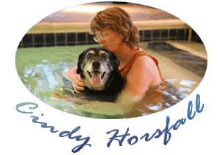
This photo I took of my dog Cricket in the pool with canine water therapist Cindy Horsfall of La Paw Spa has become Cindy's brochure cover shot and will be on her new website. I'm thrilled! Cricket, a black lab, is now 16, significantly older than most labrador retrievers live (13-14 is considered a ripe old age). I attribute her longevity in part to our bimonthly aquatherapy sessions with Cindy, who is the founder of the Association of Canine Water Therapy and has trained practicioners all around the US. We are fortunate to have her right here in the Pacific Northwest. She's terrific. Cricket loves her and loves getting massaged and stretched and swimming in the warm water pool just for dogs (and their people).

27 July 2007

Candles and the Idea of the Holy

There's a sense of the sacred in this photo, even though I personally don't find connection with the Almighty through lighting candles in a stone church. Or at least I didn't used to. I'm beginning to be able to relate to that. I used to find the practice "too Catholic" (paying for candles to light in the church smacked too much of indulgences; is God supposed to be more likely to answer my prayer if I send it up with a candle?) But now there are many things I appreciate about the Catholic way of worship that I didn't understand before. Lighting candles in prayer isn't necessarily a biblical practice, but lampstands were definitely used in worship (e.g., Exodus 25, 37; Zechariah 4; Revelation 1-2). And there's the "smoke of the incense, together with the prayers of the saints" which "went up before God" in Rev 8:4. Candlelight vigils are held by many of various faiths, including Christians, in the event of a great tragedy. There is something about a lit candle that helps people focus their attention on God. A friend of mine who is a spiritual director always lights a candle before she starts her sessions, and leaves it burning throughout the hour, to remind both herself and the directee that God is present with them and it is really God who is the Director. I have now experienced lighting candles for prayer in several different settings. I've done it in a Taizé worship service, in a Greek Orthodox Good Friday service, online, and I've even done it in my own home in front of...gasp!...an icon! I am less quick to judge the spiritual practices of others now than when I was younger.

(*) The title of this post, by the way, comes from the book The Idea of the Holy by Rudolf Otto, in which he coined the term "numinous" - that which is holy, awesome, "wholly other" about God; that which transcends rational comprehension.

19 July 2007

Facebook

OK, so I joined Facebook about a month ago, just to see what it was all about, since everyone has been talking about it. I'm still not convinced it's anything other than yet another potential time-waster for me. But it has been fun to reconnect with some old acquaintances. I decided to put a link here (in the right sidebar), so you can go and check it out and see if you want to join my circle of friends. The photo I used for my Facebook profile is a composite of one that I took of myself in my bathroom mirror (flipped in Photoshop so the word "Canon" on my camera wouldn't be backwards) with a scene I shot in New Zealand of Mount Ruapehu, a volcano.

18 July 2007

Reflection on reflection

I was looking back through my New Zealand photos to see if there were any good ones I hadn't used yet. This older gentleman agreed to let me photograph him to get the photo of the stunning backdrop reflected in his sunglasses. I like the way you can see the crows' feet on his cheek blending into the hillside in the reflection, looking as if they were ripples in the ground. There happened to be a photographer in the middle of the gorgeous scenery, but I didn't Photoshop her out. An incidental self-portrait.

Here's that same scene as it appeared unreflected, from a slightly different angle. I'd say the image in the man's lens is a pretty good likeness. Doesn't this just make you want to go there?! This photo was taken on one of the islands in the Bay of Islands. Sorry, I can't remember which one. But if you take the "Best of the Bay" boat cruise (the original "Cream Trip") offered by Fullers Bay of Islands, departing from Paihia, you'll get to see this and other beautiful sights.

OK, so this didn't turn out to be much of a reflection, but more of a sales pitch. Honest, I have nothing to gain from it, other than the knowledge that you too might be able to get some cool photos of dolphins, etc.

09 July 2007

Inspiration

Sorry for the long hiatus again. I've had my siblings visiting for the past week or so and am only just getting caught up on some of my regular computer stuff, etc.

In spite of some very big disagreements about artistic influence that my comments over on Paul Butzi's blog stirred up a while back, I'm going to engage in a bit of playful speculation again here. I know there's no way to prove it, but I enjoy this sort of musing. Besides, there are no Celts around anymore to complain about artists getting ideas from them.

I went to Scotland back in 2004 and spent some time towards the end of my trip on the Holy Island of Lindisfarne (actually off the coast of England, near the border with Scotland). There I photographed both this Celtic cross (a grave marker in an old cemetery) and this loopy pile of some sort of worm excrement on the wet sand (taken while the tide was out). I formulated a theory back then. You may well ask me what is my theory. This theory of mine, which is my theory, is as follows: The loopy Celtic knot designs were inspired by worm loops which the Celts saw while they were walking along the beaches. A further confirmation of this theory is that I later came across an interesting phrase in Seamus Heaney's translation of Beowulf: In line 1532, Beowulf's sword is referred to as "keen, inlaid, worm-loop-patterned steel." Of course the sword must have been inlaid with a Celtic knot design which was patterned after worm loops.

I corresponded with a Dr Jane Lancaster, Implementation Officer at the Berwickshire and North Northumberland European Marine Site (I found her email address on a website related to marine life near the Holy Island of Lindisfarne). She was able to tell me all I ever wanted to know about the worms that make those loops. They are lugworms (Arenicola marina), and these "loops" are their casts. She was intrigued by my question about the connection with Celtic knots, so she asked some archaelogist colleagues of hers, but I never heard back from her what they thought about it. She thinks Celtic knots had nothing to do with lugworm casts, but were inspired by vines, because the Celts lived mostly inland. I still like my theory better. Maybe I can get a research grant to study it sometime and go back to the Holy Island of Lindisfarne.

Inspired by that whole episode, and looking for a new artform to learn for my final project for the Christian Imagination class at Regent, I took up wood carving (you've seen my dolphin carving already if you've been following this blog for a while) and designed this Celtic knot pattern which I then carved into a block of bassword.

Now if my theory is correct, I've just traced the path of artistic inspiration through two generations. What might my Celtic knot carving inspire, I wonder?

29 June 2007

Cellos...sweet!

My dad plays the cello in a community orchestra. I took this photo while they were warming up for a concert. That's why I was able to get up so close and poke my camera practically into the cello section. It was taken with a 70mm lens, F2.8 at 1/40th of a second, ISO 1600. I cropped it slightly in Photoshop, but it was already definitely a close-up shot of just the hands and bows of these two cellists. I love the fact that instruments in an orchestra section play together (at least they're supposed to!) -- setting up a natural repeating pattern of lines and seemingly choreographed motions. That, along with the deep, brown tones of the wood, and the white of the players' concert attire, all contribute to the appeal of this image for me. The cello is one of my favorite instruments, both for its rich sound and for its physical beauty -- elegant curves and fine craftsmanship....And because my Dad plays it!

27 June 2007

Great new comic strip: What the Duck?

It's rare that I come across a new comic strip that I like. And it's rare that a new strip takes off and gets picked up for syndication. This one, started last year by Aaron Johnson, has succeeded on both counts. It's called What the Duck. It's about a duck who is a photographer and goes around with a camera around his neck. Here are a few that had me laughing out loud, but go visit the website and browse through the archives -- most of them are really funny.


Adobe Bridge hack for Windows Geeks

This will be a yawner for all you photographers who are switching or have switched to Mac (or have been using Mac all along). But if you're still a Windows user, and you use Adobe Bridge, and you're even remotely tempted by Geekdom, read on...

I'm tired of the experience of having a folder open in Windows Explorer, wanting to view it in Adobe Bridge, starting Bridge, and then having to navigate in Bridge to the folder I already had open in Windows Explorer. I've been wanting a way to open "this folder that I'm looking at right now" in Bridge. I was hoping for a right-click menu option or something. It didn't exist. So I figured out how to create it. ALL CAUTIONS ABOUT MESSING AROUND WITH SYSTEM STUFF APPLY HERE: Make a backup of your registry, don't attempt this unless you sort of know what you're doing, etc. [Yeah, you Mac folks are probably giggling right about now if you're still reading... ;-)]

1. Run regedit.exe
2. Navigate to "My Computer\HKEY_CLASSES_ROOT\Folder\shell" and select "shell"
3. Edit > New > Key
4. Name it Open with Adobe Bridge
5. Make sure this new key is selected
6. Edit > New > Key (again)
7. Name it command
8. With this key selected, double-click on the (Default) value in the righthand pane.
9. For Value Data, put in the full path to where your Bridge executable is stored (in quotation marks if there are spaces in it), followed by "%1" (with the quotation marks); for example, on my machine (which has the default installation of Adobe Creative Suite), I put:
"C:\Program Files\Adobe\Adobe Bridge\Bridge.exe" "%1"
10. Exit regedit.

Now you can right-click on a Folder icon anywhere in Windows Explorer, and there will be a new menu item on the pop-up menu: Open with Adobe Bridge. Select this, and Bob's your uncle.

26 June 2007

Dinner for One with Three

This one is worth clicking on to view at full size, so you can see what the title is referring to.

The icon in the background is Andrei Rublev's Trinity. If you don't know the work, here's a good discussion of it. One of the key elements of it is that the three persons of the Trinity are seated around a four-sided table with the fourth side open to the viewer, inviting us to join in the holy repast with them, as it were.

As I live alone, I eat alone most of the time. That particular evening I had prepared a fancy meal for myself in honor of a friend whose memorial service I had just celebrated that day (who had given me the recipe for that warm squash salad). In the original photo, I had the program from her memorial service standing up on the table to the left side of the plate, but I ended up deciding to crop that out, because it was irrelevant and distracting to what I felt was more important about the photo. You see, I had noticed something which I had not seen when I took it: the placement of the glass of wine precisely over the table where the Trinity are seated. So it's as if I've accepted their invitation to join them for a meal. And in return, I've invited them to join me at my table, because I fortuitously had set three empty placemats set around my table. None of this was pre-planned. At least not by me... ;-)

25 June 2007

Funny captions with humorous juxtapositions

I like this guy's sense of humor! And his photography. Herman visited my blog and posted a comment suggesting I might like this particular photo essay of his. He was right. So I'm going to do him the honor of pointing more of my readers in his general direction.

23 June 2007

Photojournalism and emotions

In this chilling article, a photojournalist describes his "struggle with how to define the conflict in Iraq without letting it define [him]." I am angry about how we were dragged into this war and how it is being conducted. That article and its accompanying photographs help me engage my emotions in a more productive way than just expressing an amorphous anger at George Bush which is really all I've been capable of until recently. I've been trying to process it through doing anagrams about him, but that doesn't really work; it only fuels the nondescript anger and/or masks it with humor. But looking at photographs, and thinking and writing seriously about what is going on, are more effective.

I never seem to be anywhere where anything newsworthy is going on. That's probably because I don't like crowds much and am not big on sleeping in discomfort or putting my life at risk. I was thinking back through all my past photographic work, and I think I've only ever taken one remotely photojournalistic shot (this one from when John Kerry's sister Diana came to speak in Vancouver), and definitely nothing very exciting or dangerous. But I do find the genre fascinating, and I think it is very important for us all to engage with at some level.

I don't have a TV, so apart from a brief invitation to a friend's apartment on the morning of September 11, 2001, during which I learned in real time of the towers' collapse, I was shielded from most of the repetitive coverage which formed so much a part of our collective national consciousness. (Well, I saw it once, and everyone else saw it ten gazillion times.) However, after 9/11, part of the way I processed that whole event and my emotions about it was to put together a portfolio of news photos that had moved me or which I found particularly excellent. I stared at them over and over and allowed the emotions to well up in me afresh. I bought all the news magazines I could get my hands on, and even several photo memorabilia books. I was looking at them not only for the emotions, though, but also as a photographer, admiring the work of fellow photographers.

After a few weeks I found I no longer was interested in looking at the 9/11 photos. They'd done their work. The images had been seared into my memory, the emotions were subsiding, I was learning to deal with the reality of what had happened and think about it at a new level. But in those first days when shock and denial and anger and fear and grief were raw, it was helpful to have the photos, to help bring me closer to Ground Zero. And I learned a lot about what makes good photojournalism through the process. I'm still not sure whether I'll ever be somewhere where I can put what I learned into practice. But it's worth knowing anyway. It has given me a yardstick by which to critique the work of photojournalists. If it can create emotions in me like those I felt when I looked at the 9/11 photos, it's good photojournalism.

Incidentally, I recently read that James Nachtwey, one of the photographers whose work I most admired from back then, was honored as one of the winners of this year's TED prize, given to those who have the best ideas for using Technology, Entertainment, and Design, to change the world for the better. The prize is $100,000 for each recipients to realize his or her conception.

22 June 2007

Popular Photography

No, not the magazine by that name. I'm talking about Nikon's brilliant marketing campaign, Picturetown. They gave 200 D40 digital cameras to 200 random people of Georgetown, South Carolina, to prove that anyone can take great pictures if they have the right camera. It doesn't completely invalidate the time-worn photographers' adage that it's not the camera, it's the photographer (which Michael Reichmann of The Luminous Landscape rightly points out is not really true anyway -- there are many factors, including the photographer and the camera). But Kodak's advertising sure attempts to blur the line between professionals and amateurs. Is there a line anyway? Or is it more a continuum?

Some of the photos showcased on that site are indeed quite nice and aesthetically composed. Others are very sharp and have good colors but are still just snapshots. Nothing wrong with "just snapshots," mind you -- in fact I think it's wonderful that more people can now take photos of their family members, pets, vacations, etc., that they are pleased with. It might take some business away from professional portrait photographers, but there is still room for us artsy types. And perhaps as good photography becomes even more accessible to the general public, more people will find the aesthetic element in it draws them to learn more and increase their skill, which I think will increase the joy they derive from doing it. That would be a good thing.

Some photographers might grumble at the thought of more competition. But when one views the process of doing art and the pleasure derived from it as half or more of the benefit of doing it (beyond the money you can earn or the positive reactions you get from other people viewing your results), then it's easier to have an abundance mentality rather than a scarcity mentality. “People with a scarcity mentality tend to see everything in terms of win-lose. There is only so much; and if someone else has it, that means there will be less for me. The more principle-centered we become, the more we develop an abundance mentality, the more we are genuinely happy for the successes, well-being, achievements, recognition, and good fortune of other people. We believe their success adds to...rather than detracts from...our lives.” (Stephen Covey)

So how does my photo of the day (above left) compare to the dolphin shot (right) by "Picturetown" resident Mark Collins, who admits he's "pretty much a novice at this"? (The Picturetown site has a feature where you can download any of the photos there, so I'm sure I'm not doing anything illegal by reproducing it here; however, I'm giving credit to the photographer and a link to the original just to be sure. See the Picturetown site for a video containing Mark's comments on how he got the shot, which is where I got the quote about his self-assessment of his skills.) My photo is better, I think. I like that it's more saturated and shows the motion of the dolphins better. His is too bland and too static for my taste, however he does have a nice repetition of curves, and he caught the fin of the baby between the adults. And he was closer. Even though my photo is probably better, I'm not sure I really have enough of an edge over this novice with a free camera from Nikon to make much of a stink about "it's the photographer, not the camera." After all, I've got a better camera... ;-)

15 June 2007

Current Reading (nothing on photography right now)

I've recently joined Goodreads, a site that lets you share what you've been reading lately (including your book reviews) with your friends, and see what your friends have been reading and reviewing too. I haven't put much into it yet, but here's the widget it generates:

Influence, and Andy Goldsworthy

It seems my comments over on Paul Butzi's blog about a photo I posted here recently triggered a whole discussion about influence between photographers. His post is quite fascinating and worth reading. I do agree that tracing the influence between artists (or writers, philosophers, historians, etc., for that matter) is a tentative science at best. But speculating about possible influence seems like a harmless diversion, unless it is motivated by jealousy or selfishness, which my speculations weren't (despite what the first couple of commenters on his post apparently thought). Anyone who teaches photography, as both Paul and I do, can't possibly have a desire to see others not succeed at it. We are more likely to be pleased when we see our own work influencing others in a good way. I might have been wrong about my speculation that my work could have influenced Paul. I think I was just giddy with delight at the thought of the possibility of it, since I've admired Paul as a better photographer than I for some time. So to hear him (or read him) say he thought my broom photo was better than his, which he said in his aforementioned post on Influence, was very encouraging indeed.

And now for something completely different: a photo in which I was definitely influenced by the same artist who very likely influenced the person who did the artwork in my photo. I came upon this on the ground between my cottage and the neighbors' at Hunterston Farm on Galiano Island. Someone must have done this. Shells don't just end up in a perfect curve on the ground by coincidence. But the artist was nowhere to be found and didn't leave a signature. However the piece reminded me so much of works by Andy Goldsworthy, and there are certain connections between folks on the farm and Andy Goldsworthy (Loren Wilkinson is a big fan of his, and Loren influences just about everyone who comes to the farm), so I am quite certain the artist was influenced by him. And I was influenced by Goldsworthy in wanting to capture this ephemeral work of art in a photograph.

Andy Goldsworthy is a British artist residing in Scotland, who does his work all over the world. He is an environmental sculptor, which means he makes his art with elements from nature, and the process of doing his art includes the inevitable decay or destruction of his works by the forces of nature: ice sculptures melting; chains of leaves in rivers being washed away by the water, etc. Watching how the elements dismantle his painstakingly created sculptures is part of how he learns about the world around him (cf. Paul Butzi on art as a verb). Goldsworthy captures all his work in photographs, because of course the works themselves (with the exception of a few installation pieces like Storm King Wall, an enormous snaking stone wall in the woods of New York State) are all ephemeral.

I first became aware of Andy Goldsworthy through the documentary film about him, "Rivers and Tides". It's absolutely mesmerizing. A couple of clips from the movie can be seen here and here.

Another video clip:
Nature and Nature: Andy Goldsworthy

Some static examples of his work can be seen here, here, here, here, here, and here (this latter is Google Images Search).

Some articles about his work:
Andy Goldsworthy: The Beauty of Creation, 35 Who Made a Difference: Andy Goldsworthy (Smithsonian Magazine), Q & A with Andy Goldsworthy (TIME), Natural Talent (The Observer)

Can you tell I like this artist?! :-)

Paul Butzi on "Art is a Verb"

This is just a convenient place for me to keep links to all of Paul's best writings on "Art is a Verb" for when I want to refer others to them. I'll try to keep these up-to-date, but no promises. Let me know if you find a broken link.

Art is a Verb, not a Noun
Why "Art is a Verb" is Important

13 June 2007

Being "in the zone"

I read an interesting post on creativity today on Doug Stockdale's Singular Images blog. Some key excerpts:

…from Octave of Prayer, Minor White wrote “Intensified concentration is common to all creative people…philosphers name this concentration Creativity; the devout call it Meditation”.

[H]e describes different ways of artists getting into what I call the ”zone”. Time seems to drift. There is an intensity to the moment as the concentration seems to increase almost on its own. You seem to flow effortlessly.

I remember an old adage; try to make at least one exposure within the first 15 minutes of arriving at the area you are interesting in photographing. Now I understand that this is a methodology to engage me and my vision, increase my concentration and make a quicker transition in to the “zone”.

I long for that experience. I'm not sure I've ever had it, or if I have, it has been so long that I've forgotten it. I usually have no problem making an exposure within the first 15 minutes, but I think I usually make one too quickly, without taking the time to size up my surroundings and engage in meditation. Thus I usually get tired of an area quickly and move on, or stop shooting. That's not entirely true when I'm somewhere that totally takes my breath away. But I think that's different than being "in the zone" as Doug describes. When rapt by the sheer beauty of a place, I sometimes don't even think about the process of creating my art. I also do it too quickly, since I'm more interested in simply absorbing the experience of being in that place. Not that that is a bad thing, mind you. If I were incapable of appreciating beauty except by making art about it, I'd be impoverished as a human being, I think.

It seems to me that being "in the zone" can be independent of the level of ordinariness or beauty of the subject being photographed, however due to the spiritual atrophy most of us suffer from, we usually need beauty to kickstart the experience.

One experience I can remember that comes closest to being "in the zone" was when I was visiting some relatives in Italy and I accompanied a cousin and her granddaughter to the playground. As we were walking home, I saw the little girl catch a glimpse of a water fountain up ahead and run towards it gleefully. The lighting was perfect, my camera was in hand, and I was alert to the moment. I ran ahead of her and reached the fountain before she did. When she got there, I just started shooting, enjoying watching her delight in how the water felt on her hands, recalling a lost childhood of my own, etc. It was positively magical. This all happened in a matter of seconds, perhaps a minute and a half at most. Here is the prize photo that came out of that.

I have just discovered Picasa Web Albums. A great way to share a series of photos from a trip if you just want to upload them and not bother with blog commentary. Free, easy to publish with, and the nicest viewer UI of any web album product I've seen yet. All you need is a Google account, which all of us Blogger users have anyway. In fact, if you have a blog on Blogger, when you sign up on the Picasa website, it automatically makes an album of all the photos you have posted in your blog, and keeps adding new ones automatically as you post more to your blog. However, it seems to put them in random order initially (though you can reorder them however you like afterwards), and it only goes back so far. In my case, 83 photos, back to December 2006.

Mystery photo: Form and texture

Sorina asked me to bring back the long neglected mystery photo feature. I just realized while posting this photo that it kind of fits the bill. But it also provides material for a brief lesson in composition. Two of the elements of visual design that contribute to interesting photographs are form and texture. This photograph displays both of them. I find it endlessly interesting to run my eye over the curves in this...whatever it is. What part of a tree do you think it is? It looks like one of those "impossible figure" optical illusions to me.

10 June 2007

Worshiping God through art

[First paragraph is an excerpt cross-posted from Iambic Admonit]

One of the reasons we do art is to glorify God and worship him through the very process of doing our art, not just through the final result. Our doing art would bring joy to him even if nobody else ever saw it. A few weeks ago, I was driving south on I-5 through Washington State, and the quality of light hitting the trees on the mountains with their multiple shades of green -- darker in the coniferous parts of the forest and lighter in the deciduous trees -- was nothing short of heavenly. I felt upwelling inside of me an uncontrollable urge to make a picture on the spot. Not a photograph, but a painting. I don't paint, but I wished then and there that I did, and that I had my paints with me. I didn't even have my camera with me. I told a friend about the experience later, and she said "oh yes, it would have been great to capture that scene, but it'll have to remain in your memory." But she didn't get it. It wasn't so I could "capture" the scenery and remember it or show it to others. It was so I could worship God for the glory of his creation, then and there, that I wanted to do the art. I think I'm finally growing into the kind of artist that God wants me to be, when that is my response to the beauty of his creation. I suggest you think about these things when doing your photography, and see if it helps you grow in your relationship with God.

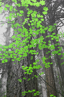
This photo is nothing like what I saw that day, but it's an exploration in light and color among trees, so it's at least a relevant theme. This is from a photo I took in Lynn Canyon Park on the same day I did these, but highly stylized with Photoshop editing (mostly Hue/Saturation adjustment layers).

Color theory - "something red"

While writing that last post I found myself poking around on the web looking for some more information on color theory, of which I only knew the most basic points, and that mostly by intuition. I found an interesting explanation with examples to show how different background colors can have different effects on the impact a foreground color has, and can even make the color look like a different color. See the sections titled "Color context" and "Different readings of the same color" at Color Matters' Color Theory page. I can't reproduce the images here as they are copyrighted, but they're pretty cool.

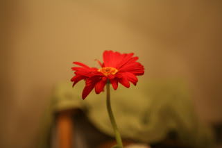
I recently had some relatives from Italy visiting me. Her grandfather had been an early pioneer in photography. Her husband remembers when color photography first came on the scene and people were told to always have something red in their photos. They showed me their photos from their National Parks tour and indeed they chose on many of them to have something red in the scene. I'm not sure that bit of advice about something red isn't as outdated as "something old, something new, something borrowed, something blue," but Doug Plummer's photo of the day with the lady with the red shoes getting out of a car sure packs some punch, so maybe there's some truth to it. The photo accompanying this post, by the way, is the very first photo I ever took with my Canon 5D. Something red indeed!

Photo of the day

Doug Plummer has an interesting post (thanks to Paul Butzi for pointing it out) about the process he uses in making his photo of the day. Reminds me that was originally my intent in starting this blog, though I have had a hard time keeping up the every day frequency. My process is similar though not as elaborate. It really is more of an unfolding or discovery than going out specifically with something in mind that I want to create.

I have been noticing more often lately people writing about the process of making art as being more important than the final product. Doing photography is a way of learning about the world, about myself, and about God. I think a recovery of that aspect of art is key to making the arts relevant to the church again in this day and age. Jeremy Begbie, with his Theology Through the Arts idea, is the first person who introduced me to using the arts as an active way of engaging with and discovering Truth. He seems to have had a ripple effect on many others. Or maybe the time was just ripe for this concept.

My photo for today is one that I took when I was explaining to my friend in Bellingham about how colors opposite each other on the color wheel go well together in a photo. Blue and orange, red and green, purple and yellow. I enhanced the saturation of the sky a tiny bit in Photoshop, but the leaves really were this brilliant red-orange.

08 June 2007

Self-portrait redux

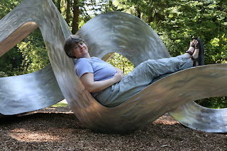
A while back I wrote a post about some of the various ways of making self-portraits and reasons for doing so. Here's one I did recently using my tripod and self-timer at Big Rock Garden Park in Bellingham. It is a wooded park filled with sculptures. This one caught my eye because of its lovely curves. I found a dip that looked comfortable to rest in and made this photo, mostly to show "I was there" but also to explore form and shape of the human body in relationship to the curvature of this sculpture.

04 June 2007

Whatcom Falls, or "What goes up must come down, come what may"

From my Bellingham June 2007 photo shoot series, this is Whatcom Falls. Waterfalls are another favorite subject of mine. To get that neat effect where you can see the motion of the water, you've got to use a slow shutter speed. I shot this one at nearly 2 seconds. That's pretty long in photography time. Then of course to compensate for letting in so much light with the long shutter speed, you've got to use a tiny aperture (large f-stop number). I shot this one at f/20. You also might want to use a very slow film speed if you have that ability. I set my camera to ISO 50 for this. If you've still got too much light, your only other option is to use a neutral density filter, which attaches to the end of the lens and decreases the amount of light entering the lens by 1 stop or 2 stops, or whatever number of filter you've got. I could have used about a 1/3 stop ND filter on this shot, but didn't have one with me. I could probably have sacrificed a bit of the motion in the water by speeding up the shutter a tad. But to be honest, I wasn't paying much attention to my own photos, as I was there mostly to coach my friend in her work, so I didn't take the time over it that I might have normally.

I did go over this in Photoshop with the Burn Tool in some patches of the rocks to the left that were washed out in sunlight. But there's not much you can do to burn in detail where the image is blown to pure white, like where the water collects between the rocks in this photo. It's still a good illustrative photo, and pretty nice looking if you don't know much about photography. But I'm not 100% satisfied with it.

03 June 2007

Another iris

I spent part of the weekend with a friend in Bellingham, giving her a photography tutorial, and going out shooting together at Big Rock Garden Park and Whatcom Falls Park. Got some nice photos, so I'll be sharing those over the coming days. This first one was taken in my friend's garden before we set off to the parks. Unlike with my other recent post of an iris, I didn't touch up the background of this one at all. All I did in Photoshop was what I do on just about all my images: some sharpening (using the "Unsharp Mask" filter, which seems to have a name opposite to what it really does -- it sharpens an image, but I suppose it is named for the idea that it masks out anything that's "unsharp").

30 May 2007

Teaching photography

I had the joy of teaching a photography workshop at my church retreat this past weekend, helping people to see the world in new ways, and improve their photography while they were at it. I was quite impressed with the results of my students. One assignment I gave was to go shoot a roll of film's worth (30-40 digital photos) from unusual vantage points. One guy took a picture of his own reflection in a car bumper, and you can see his feet sticking out down below the reflection. Because of the curvature of the bumper, it looks like he's just a face with feet. Very amusing, and I'm still puzzled at exactly how he got it to look the way he did. One woman took a picture of a kid on a trampoline, as seen from beneath the trampoline, so you just see this girl in silhouette through the mesh, floating in the air with trees behind/above her. Both of those photos were quite striking in how they stepped away from the usual way we see the world.

One of the ironies of teaching photography is you don't generally get to take any pictures yourself, because you need to be available to coach the students and answer questions, etc. But I did manage to take a few photos over the weekend (none from unusual vantage points, though). This one was of a shrub on the grounds of Westminster Abbey, a Benedictine monastery in Mission, BC, where a few of us went for a Taizé service Saturday evening. No Photoshopping, apart from the routine resizing and Unsharp Mask.

22 May 2007

When is a photo no longer a photo but a painting?

I created this image starting from a photograph I took of six bride's maids dressed in colorful dresses getting ready for a wedding. It was a lovely photo to begin with, but I wanted to experiment with the qualities of the colors and obscure the naturalism quite significantly to make it more impressionistic. I applied a generous amount of manipulation in Photoshop using the Art History Brush tool, and this is what I settled on as my final result. The feeling of using the Art History Brush on a blank layer which is superimposed over the original image is really very much like painting with a brush on a blank canvas. Though I'm not adept at using real brushes and paint, I am learning to reproduce a similar effect in Photoshop. So my question is this: when does a photo cease being a photo and become a painting? This looks more like a painting to me than it does like a photo. Of course it's not a "real" painting, it's a digital one. But I still think it's a painting. However, it's also a photo, since all the colors came originally from an image made on a camera. The texture and a certain degree of where the boundaries fall between color patches come from my brush strokes.

20 May 2007

"Getting into Pictures" in Photoshop (5 part tutorial)

Here, for the sake of convenience, is a link to all five parts of the tutorial on "Getting into Pictures" in Photoshop -- how to make realistic looking composite images in Photoshop where you put yourself (or someone you know) into a famous work of art (or another photograph):

Part 1
Part 2
Part 3
Part 4
Part 5

3D Panorama of Bodega Ridge

I've just discovered Albatross Design Group's (ADG) Panorama Tools software. What fun! Here's a 3D panorama created from a number of overlapping photos I took at Bodega Ridge on Galiano Island a couple of weeks ago. I did the stitching in Photoshop, but then Panorama Tools turned it into this 3D thing that you can rotate by dragging.

I couldn't upload the panorama movie to Blogger, but if you click on the still image below it will take you to the panorama on my website. Once you're there, click to activate the control, and then click again and drag the mouse around (from left to right and back again) to rotate your view in the direction the mouse is moving. The dragging direction feels kind of backwards to me, but that's the way they've implemented it. If you've got your browser set at a high security level to block active content (in Internet Explorer an alert bar comes up across the top of your window with a beep), you'll need to click allow this one through.

18 May 2007

Calla lily

Another one of my New Zealand flowers series. It's not a New Zealand native, but I saw it and photographed it there, in Hamilton Gardens.


Photography Directory by PhotoLinks