30 May 2007

Teaching photography

I had the joy of teaching a photography workshop at my church retreat this past weekend, helping people to see the world in new ways, and improve their photography while they were at it. I was quite impressed with the results of my students. One assignment I gave was to go shoot a roll of film's worth (30-40 digital photos) from unusual vantage points. One guy took a picture of his own reflection in a car bumper, and you can see his feet sticking out down below the reflection. Because of the curvature of the bumper, it looks like he's just a face with feet. Very amusing, and I'm still puzzled at exactly how he got it to look the way he did. One woman took a picture of a kid on a trampoline, as seen from beneath the trampoline, so you just see this girl in silhouette through the mesh, floating in the air with trees behind/above her. Both of those photos were quite striking in how they stepped away from the usual way we see the world.

One of the ironies of teaching photography is you don't generally get to take any pictures yourself, because you need to be available to coach the students and answer questions, etc. But I did manage to take a few photos over the weekend (none from unusual vantage points, though). This one was of a shrub on the grounds of Westminster Abbey, a Benedictine monastery in Mission, BC, where a few of us went for a Taizé service Saturday evening. No Photoshopping, apart from the routine resizing and Unsharp Mask.

22 May 2007

When is a photo no longer a photo but a painting?

I created this image starting from a photograph I took of six bride's maids dressed in colorful dresses getting ready for a wedding. It was a lovely photo to begin with, but I wanted to experiment with the qualities of the colors and obscure the naturalism quite significantly to make it more impressionistic. I applied a generous amount of manipulation in Photoshop using the Art History Brush tool, and this is what I settled on as my final result. The feeling of using the Art History Brush on a blank layer which is superimposed over the original image is really very much like painting with a brush on a blank canvas. Though I'm not adept at using real brushes and paint, I am learning to reproduce a similar effect in Photoshop. So my question is this: when does a photo cease being a photo and become a painting? This looks more like a painting to me than it does like a photo. Of course it's not a "real" painting, it's a digital one. But I still think it's a painting. However, it's also a photo, since all the colors came originally from an image made on a camera. The texture and a certain degree of where the boundaries fall between color patches come from my brush strokes.

20 May 2007

"Getting into Pictures" in Photoshop (5 part tutorial)

Here, for the sake of convenience, is a link to all five parts of the tutorial on "Getting into Pictures" in Photoshop -- how to make realistic looking composite images in Photoshop where you put yourself (or someone you know) into a famous work of art (or another photograph):

Part 1
Part 2
Part 3
Part 4
Part 5

3D Panorama of Bodega Ridge

I've just discovered Albatross Design Group's (ADG) Panorama Tools software. What fun! Here's a 3D panorama created from a number of overlapping photos I took at Bodega Ridge on Galiano Island a couple of weeks ago. I did the stitching in Photoshop, but then Panorama Tools turned it into this 3D thing that you can rotate by dragging.

I couldn't upload the panorama movie to Blogger, but if you click on the still image below it will take you to the panorama on my website. Once you're there, click to activate the control, and then click again and drag the mouse around (from left to right and back again) to rotate your view in the direction the mouse is moving. The dragging direction feels kind of backwards to me, but that's the way they've implemented it. If you've got your browser set at a high security level to block active content (in Internet Explorer an alert bar comes up across the top of your window with a beep), you'll need to click allow this one through.

18 May 2007

Calla lily

Another one of my New Zealand flowers series. It's not a New Zealand native, but I saw it and photographed it there, in Hamilton Gardens.

"Getting into Pictures" in Photoshop, Pt. 5 (final)

This is Part 5 of a 5-part series.

Today we are going to fix up the skin color and the noticeable edges. For the color adjustment, we will add an adjustment layer. Make sure the face layer is active (sometimes called "targeted" in Photoshop lingo) in the Layers palette. Now choose Layer > New Adjustment Layer > Color Balance. Turn on the checkbox "Use Previous Layer to Create Clipping Mask" -- this will make sure that the adjustment applies only to the face. Click OK. Play around with the sliders for the Cyan-Red, Magenta-Green, and Yellow-Blue axes until you get the color you want, and then click OK. (You might also be able to get the color adjustment you want using any of several of the other adjustment layer types, for example Hue/Saturation, Curves, or Selective Color. One of the frustrating things about learning Photoshop is that there are often multiple different ways of doing the same thing. Just play around with these other adjustments to get used to what they can do. I found the color adjustment I wanted on Jane's face using Color Balance with the color levels set to +8, +6, and -53, respectively.

Now I complete the transformation of Jane's hair into Mona Lisa's hair. A bit more tweaking of the mask first. But...oops! Mona Lisa's forehead is higher than Jane's so her face shows through where I've removed Jane's hair in some spot. This is a job for the Clone Stamp tool (). This time we need to first make sure the background (Mona Lisa) layer is targeted. Select a reasonable brush size that's smaller than the area you're going to be working with, and has soft edges. To use the clone stamp tool, select it from the Tools palette. Now choose a spot that you want to clone from, move the mouse over it, and hold down the Alt key while you click. Then click on a destination spot that you want to clone that source to. Think of it as sort of a copy/paste. You'll want to keep picking a new source area each time you clone, in order to keep the cloned area from looking too obviously like a duplicate of a nearby area in the painting.

To fix the abrupt transition between Jane's neck and Mona Lisa's, I used a combination of tweaking the layer mask, clone stamp tool on both layers, and the Smudge Tool (; to find this tool, click and hold on the Blur Tool ( and select from the dropdown menu). The Smudge Tool does just what it name sounds like. You click and drag on an area of the image, and it sort of "smudges" the pixels from the place where you started dragging into the place where you released the mouse. Go back and forth to get just the blending you want between the two sides of the boundary.

Finally, you can use Image > Trim or the crop tool () to remove any extraneous canvas area. With the crop tool, simply click and drag out a rectangle to indicate the area you want to crop to, and press Enter to commit the changes.

As a finishing touch, I've now added this frame (one of the many Filters available from Alien Skin Software's Splat! [UPDATE: no longer available]). And here is the final result:


The End!

16 May 2007

Iris

I love irises. They are probably about my favorite flower. There are all kinds of symbolic and theological reasons I like them (three petals like the Trinity, purple a royal color, Iris in Greek mythology, etc.), but the bottom line is they are just plain beautiful, and I love purple. Here's a photo I took of an iris down in New Zealand which I've Photoshopped a bit to simplify and colorize the background. If you think that's cheating, then so is painting. I'm just using different tools to create the look I want.

12 May 2007

"Getting into Pictures" in Photoshop, Pt. 4

This is Part 4 of a 5-part series.

The next step is to fine-tune the matchup between Jane's face and Mona Lisa's hair. We'll do this using two new techniques. Free Transform, to resize and reposition the face. And adjusting the opacity of the top layer temporarily, so we can see through to the background for precision in positioning. We'll finish painting the layer mask once we've got the face in exactly the right place and know what bits to mask out.

So, make sure that the top layer (Jane) is active by clicking on it in the Layers palette. Then select Edit > Free Transform. You now see a sizing rectangle with "handles" on it that you can do all kinds of transformations with. The three we'll use are:

1) rotation - position the mouse anywhere outside of the rectangle, and the pointer becomes a double-headed arrow which you can drag in a rotational direction to turn the layer image about its center point; you can drag that center point around if you want to move the point of rotation to somewhere else
2) scaling - drag from one of the corner handles to make the image smaller or larger; make sure you hold down the Shift key while doing this, as that will maintain the aspect ratio and prevent distortion
3) moving - click anywhere inside the rectangle (except on the center point) and drag to reposition the image

Once you have done all the rotating, scaling, and moving that you want, press Enter or click the checkmark icon (the Commit button) on the options toolbar to commit these changes.

Using those three techniques, now do the best you can to position the face over the background and make it match the size of the place where it's going to fit in. If you mess up at any point along the way, you can undo one step of the changes by presing Ctrl+Z or cancel out of them entirely by pressing Escape.

If you find that scaling the face larger makes its resolution too poor, you can alternatively resize the background layer smaller to fit, using the same method. You might need to zoom out using Ctrl+0 to be able to see the sizing handles in this case.

In positioning the face, you might find that you can't see the background well enough to get the position exactly right, because too much of it is obscured with the stuff surrounding the face in the top layer which you haven't masked out yet. It's kind of a Catch-22. You don't know what to mask out until you've got it positioned right. Here is where adjusting the opacity comes into play.

At the top of the Layers palette are a bunch of controls, including Opacity (set to 100% by default). With the face layer selected, click the dropdown arrow next to Opacity, and drag the slider to somewhere much lower, perhaps 20 to 50%, whatever works best for you given the colors of the images you're working with, so that you can still see enough of the top layer to work with it, but enough of the background to position the face accurately.

When you go back to working on the mask, set the opacity back to 100%. You might need to iterate back and forth between these two stages a couple of times to get everything just right. As I mentioned in an earlier lesson, set the brush to a smaller diameter and its hardness down to 0% when doing the precision mask work near the edges of where the face will finally meet up with its background. And zoom in to a greater magnification (Ctrl++) so you can see what you're doing.

I tried to get the proportions of Jane's features to match those of Mona Lisa (impossible to do it perfectly since ML's chin is so small). And I lined up her cheek line and neck, not worrying too much about the hair line. Then I masked out the rest of the background. The images in this post show where I've gotten so far, in two intermediate stages -- first with opacity of the face layer set to 70% after I'd positioned the face, but before I'd finished painting the mask, and the second back at 100% after masking.

All we have left to do now is fix up Jane's skin tone to match the painting, and do a better job of blending the hair and the place where their necks join. That's for next time.

Go on to Part 5.

04 May 2007

Unintentional humor

Another one of those humorous juxtaposition photos of mine. I saw this in the supermarket the other day. I pointed out the humor in it to the lady standing next to me in the check-out line. She said she never would have noticed. Do you see what's funny about this picture? I seem to have a knack for this. Without even looking for it, I see all over the place funny incongruities between things that are haphazardly (or sometimes intentionally) placed together. Notice the label on the rack that this booklet was placed in: "Not for Adults". (Silly wabbit! Low-Calorie Dieting is for kids! Now wait a minute...that means adults are no dummies!)

I actually didn't have my camera with me when I first saw this, so I came back the next day to get the photo. Fortunately this checkout stand was closed when I came back, so I wasn't making a nuisance of myself holding up the line. Amusingly, by the time I came back, they had changed the booklets that were in the rack. The original ones I'd seen were just as funny in the context, something like "Walking for Fitness."

Another thing I find amusing about this is that we're not used to seeing "Not for Adults" on things in the tabloids section of a supermarket checkout stand. Usually it's the other way around: the Playboys and such which are "For Adults Only" -- though fortunately I think the public outcry for common decency has gotten the worst offenders moved away from where kids can see them.

There is so much to chuckle and smile at out there, if you're attentive to it. I think my attempts at living a somewhat contemplative life have made me more aware of my surroundings and have helped me to notice things like this. Being a photographer is part of that. Having the sense of humor to enjoy such things is also key. I'm not sure how I developed that. I think it was part of the heritage my parents gave me.

"Getting into Pictures" in Photoshop, Pt. 3

This is Part 3 of a 5-part series.

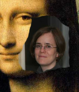
Today I'm going to show you how to clear away the unwanted background around the face in the photograph. To do this, you'll need to know the basics about layer masks. Normally, a layer completely obscures any layers that are beneath it (the stacking order is the order shown in the layer palette). So where we left off yesterday, the photo of Jane covers over the part of Mona Lisa that is beneath it. But Photoshop allows you to associate an optional "mask" with each layer. This mask indicates which regions of the layer will be transparent (showing through the content of the next layer below) and which will be opaque. A layer's mask is black & white, and is the same dimensions as the layer. Wherever there is white in the mask, the layer is opaque there, and wherever there is black in the mask, the layer is transparent. You can also think of painting black into the mask as "erasing" the content of the layer in those places so that the background shows through. But it's a non-destructive kind of erasing, because the layer image is still there.

Now let's create the layer mask. In the Layers palette, click to select the top layer which is the photograph ("Jane" in my example). Note: don't click on the "eye" icon beside the layer, as this will turn off/on visibility of the layer, but click on the thumbnail or text label of the layer. Now choose Layer > Layer Mask > Reveal All (or click on the "Add layer mask" icon () at the bottom of the Layers palette). This creates a default mask that is all white. You'll see its thumbnail show up next to the layer thumbnail. Now be sure the layer mask thumbnail is the one that's active (there should be thicker lines around the four corners of it), as opposed to the layer thumbnail. This is a very subtle difference, but it's important, as it will ensure that you're painting only in the mask and not obliterating the image in the layer itself. The mask will be selected by default when you first create it, but get in the habit of verifying that the right item is active whenever you're about to paint in a layer or its mask. To activate one or the other, just click in the corresponding thumbnail.

Now we're going to select the eraser tool () to paint black onto the areas we want transparent. You could use the brush tool () with black as your foreground color if you prefer, but it's equivalent to selecting the eraser tool with black as your background color. For now, let's use the eraser tool.

To set foreground or background color, normally you'd click on the top or bottom swatch of color (foreground and background, respectively) in the color selection area of the Tools palette: , and the Color Picker would come up. But for setting the colors for a mask, there's a quicker way. Simply click on the tiny icon of overlapping squares in the lower left of the color selection area in the Tools palette. This sets the foreground and background colors to their default settings, which for masks is always white and black, respectively. (It's the opposite for painting in layers.)

We'll also need to select an appropriate brush size to give us precise control over painting. (Even when working with the eraser tool, we still use the metaphor of painting, and have access to all of Photoshop's rich brush options.) We'll start with a large brush to paint (erase) the large areas of the mask roughly, but then we'll go down to a smaller brush for more precision in the details near the face. To select the brush size, click the Brush dropdown (the little triangle to the right of "Brush:") on the Options bar at the top of the Photoshop window. Choose the largest round brush you see there (it'll probably be 19 pixels), and then drag the Master Diameter slider over to the right to, say, 100 pixels. Keep the hardness at 100% for now. To make the dropdown go away, click anywhere outside it.

Now the fun begins. Just start painting (clicking and dragging the mouse) all over the background of the photograph where you want to erase it. When you start getting close to the face, you can reduce the size of the brush by hitting the left bracket key ([) multiple times. If you need to zoom in to be able to see the details better, you can press Ctrl-+ (Ctrl and the plus key) as many times as you need to (and use the scroll bars to go to the section that you want to focus on). Ctrl-- (minus) zooms you back out. Ctrl+0 (zero) zooms out to exactly the right size for showing the entire image. If you erase too much by mistake, don't worry. You can always paint white back over the areas where you goofed, by exchanging foreground and background colors (click the double-headed arrow near the color swatches, or press the X key).

Don't get too detailed with masking around the face just yet, because we'll need to position the face better over the painting in order to see exactly what parts need to be erased. I'll leave you hanging on that until next time... In the meantime, save your work! Here's a detail of what mine looks like so far:


Go on to Part 4.

03 May 2007

Hummingbird up close!

I can't skip over the eye candy that some of you frequent this blog for. Don't want to bore my loyal followers [all three of you ;-)] with a Photoshop tutorial that you might never use, so here's a break in the lesson plan to whet your appetite.

I saw this little tiny nest near the woodshed at our cottage on Galiano Island. The egg in it was about the size of a Jelly Belly (i.e., no more than 1/2" long). So I knew it must probably be a hummingbird's nest. And sure enough, when I went out to look the next evening, there was mama hummingbird, sitting on her jelly bean egg. She let me get pretty close for a few snaps, including with flash. I was amazed. She must really have wanted to protect that wee one, or else she was just so scared of me, like a deer in the headlights, that she didn't know what to do. I felt badly, because she did eventually fly off. But I was comforted by the fact that she was back on the nest a little while later, so I didn't frighten her away from caring for her unborn baby. And the thunderstorm we had the next day didn't knock the nest down or the egg out (thank God), though I wasn't able to stick around long enough to see whether mama would come back to the nest again. But if she could withstand the flashes from my camera, I'm sure lightning was no big deal to her.

"Getting into Pictures" in Photoshop, Pt. 2

This is Part 2 of a 5-part series.

The next step is to get the two pictures together into one Photoshop (.PSD) file in two different layers, in order to be able to work with them. To do that, open both files (which you presumably have in JPG format) in Photoshop. I like to use the image that's going to form the background as the "working file" so we're going to drag the other image into it as follows: Position the windows so that you can see them both next to each other. Select the "Move" tool (
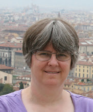
) in the upper right corner of the Tools palette. Click on the photo of the person you know, drag it into the image of the artwork background, and release the mouse button. Now immediately do File > Save As, and give it a new name, to save it as a PSD file and avoid accidentally overwriting the original artwork.

You now have a Photoshop file with two layers. Double-click on "Layer 1" in the Layers palette (which you can show via the Window menu if it isn't currently visible), and rename it something sensible, such as the name of the person whose photo it is (I'll call mine "Jane"). Double-click on "Background" in the layer right below that and the "New Layer" dialog will come up. Give it the name of the painting (in this case, I'll call mine "Mona Lisa"), and click OK. What this does, in addition to renaming the background, is it also unlocks that layer and makes it fully editable. Notice that the little lock icon disappeared to the right of the layer name after you OKed the "New Layer" dialog.

Don't worry for now if the relative sizes of the images are way out of whack. We'll fix that in the next lesson. But I am going to do one more step here, and that's flip the image of Jane around the right way so that it will begin to match better the orientation of Mona Lisa's face. To do that, click in the Jane layer to select it, so that it's one that any subsequent layer-specific commands will apply to. Now choose Edit > Transform > Flip Horizontal. Save again, and we'll come back for more next time.

To the right is what I've got so far, and here's what my Layers palette looks like:


Go on to Part 3.


Photography Directory by PhotoLinks