Showing posts with label photo tips. Show all posts

16 February 2010

Focal lengths

Someone over on a Flickr group I'm part of was asking us to post some wide angle portraits and pet shots. I didn't have any to share, but I did post this:

The widest angle I've got is 28mm. It was interesting that you asked this question, because that led me to discover a feature in ACDSee, the photo organizing software I use, that lets me search for photos by focal length. I was surprised to find out how seldom I used the 28mm focal length. (I have 28-70mm and 70-200mm zoom lenses.) I tend to do portraits and pet photos somewhere between 60-100mm.

I did a breakdown of what focal length I've used on all my photos since I switched to digital:
28mm - 491 shots
29-39mm - 3382
40-49mm - 4239
50-59mm - 3898
60-69mm - 2508
--> 70mm - 7288 *
71-100mm - 697
101-130mm - 564
131-160mm - 377
161-199mm - 347
200mm - 1879

By far my favorite focal length is 70. Not surprising, since that's the highest I can go on my short lens and the lowest I can go on my long lens, so when I'm stretching the limits and wish I had the other lens with me, that's where I'll gravitate.

It's also interesting that I prefer the 200mm extreme to the 28mm extreme, but the larger majority of my non extreme (including 70mm as an "extreme" because it's the end of the range on both lenses) shooting is done on the shorter lens. That's probably mostly a matter of practicality. It's lighter and smaller, and it lives on the camera (it's the only one that it fits in the case with on it), so if I'm going out and only want to bring one lens, that's usually the one that comes with me.

Wide angles lenses (smaller focal lengths; 35 and below) are best when you want to fit a lot into your photo, either a wide landscape scene, or an entire subject from close up (this was shot at 28mm):


Medium length lenses (about 60-90mm) are good for portraits (this was done at 70mm, from fairly close to the subject):


Long lenses (aka telephoto; about 135 and up) are good for close-ups from a bit of a distance (this was done at 200mm):

13 June 2007

Mystery photo: Form and texture

Sorina asked me to bring back the long neglected mystery photo feature. I just realized while posting this photo that it kind of fits the bill. But it also provides material for a brief lesson in composition. Two of the elements of visual design that contribute to interesting photographs are form and texture. This photograph displays both of them. I find it endlessly interesting to run my eye over the curves in this...whatever it is. What part of a tree do you think it is? It looks like one of those "impossible figure" optical illusions to me.

10 June 2007

Color theory - "something red"

While writing that last post I found myself poking around on the web looking for some more information on color theory, of which I only knew the most basic points, and that mostly by intuition. I found an interesting explanation with examples to show how different background colors can have different effects on the impact a foreground color has, and can even make the color look like a different color. See the sections titled "Color context" and "Different readings of the same color" at Color Matters' Color Theory page. I can't reproduce the images here as they are copyrighted, but they're pretty cool.

I recently had some relatives from Italy visiting me. Her grandfather had been an early pioneer in photography. Her husband remembers when color photography first came on the scene and people were told to always have something red in their photos. They showed me their photos from their National Parks tour and indeed they chose on many of them to have something red in the scene. I'm not sure that bit of advice about something red isn't as outdated as "something old, something new, something borrowed, something blue," but Doug Plummer's photo of the day with the lady with the red shoes getting out of a car sure packs some punch, so maybe there's some truth to it. The photo accompanying this post, by the way, is the very first photo I ever took with my Canon 5D. Something red indeed!

27 January 2007

Black swans with cygnets

Another in the New Zealand series. I'd never seen a black swan before, but they were all over the place on the lakes in the Rotorua area. I took lots of photos of this family, trying to get one with the parents' necks lined up just right so they were in the shape of a heart enclosing their babies. I did get one like that, but in the end I liked this one better. Sometimes perfect symmetry works in a photo; more often a little asymmetry is better.

07 January 2007

Palm Pilot Photography

My dad recently sent me this amazing photo he had taken on his 1.2 megapixel Palm Pilot. It's called Wild Acres Marsh. Click on the image to view it at full size. I have not compressed it at all, so that you can see the quality of it. Not bad, eh? I was pretty impressed that it came out so well given the cruddy resolution of Palm Pilots. All the credit goes, of course, to my dad (who was, incidentally, my earliest inspiration for photography). The composition is wonderful. I love the use of line, both the vertical lines of the dead trees in the marsh and the curving lines of the field leading the eye towards the living (though denuded for winter) tree. The colors are rich, and the mist swallowing up the receding background gives the whole thing a mystical quality. The latter is why it works at a lower resolution, I think.

This just goes to show you that you don't need ultra-high resolution on a camera or lots of fancy controls (any controls, for that matter, other than a shutter release) in order to do great work. The eye of the photographer is more important than the technical gadgetry. Photographers often bristle when someone praises our artwork by saying "Wow, that's a great photo. You must have a really awesome camera!" The best retort (thought of no doubt in a case of l'esprit de l'escalier) was "If a chef makes you a fine meal, do you say 'That was delicious. You sure must have some great pots and pans!'?"

As I told my dad, this photo reminds me of some of Paul Butzi's work in his Snoqualmie Valley gallery.

04 January 2007

Painting with Light #1

I'm preparing a series of photos for an upcoming exhibit in February/March, and thought I'd use this as an opportunity to give you all a sneak preview. The exhibit will be called "Painting with Light." It's from a group of photographs I shot of various outdoor Christmas lights, at night, handheld, with intentional camera movement. The mystery photo from a couple of weeks ago was one of those.

The technique known as "painting with light" is defined as "[using] a non-stationary light source (for example, a moving flashlight in your hand) as the primary method of illuminating your subject in a creative manner." Generally you've got a still subject in a darkened room (or outdoors at night), and you illuminate it (or parts of it) progressively with a moving (and possibly interesting-colored) light source during a long exposure. We had a session on this in a photography class I took. It feels kind of like painting in the air with an enormous paintbrush (e.g., a flashlight), except you can't see what you're painting until the exposure is finished (and developed, if you're using film). Here are some interesting examples from a digital photography contest on painting with light. My photos in this series don't technically follow the textbook definition of painting with light (if there really were a textbook definition), since my subject is the light source itself. But by moving my camera, I am painting an image on the film (or in this case the digital sensor) with light.

I will post a selection of photos from my exhibit as I prepare them over the coming days. Probably little or no commentary beyond this introduction.

In this photo, the original scene was a bush with a bunch of small colored lights strung in it. Each of those colored arcs you see is created by the path of one lightbulb (my camera was moving, not the lightbulbs, but relative to my lens, it was as if the bulbs were moving). It was a relatively fast exposure compared to most in the series (1/3 sec at F/16, whereas most of them were 5 seconds). So the lines are thin and well-defined (the fact that I focused directly on the bulbs first also contributes to that), and I had to move the camera extremely fast to get any interesting pattern at all. As you'll see, though there are similarities in the series, they are all quite unique. This is one of my favorites.

03 January 2007

Backgrounds and foregrounds

Hello to all you new readers who have started following my blog since my Christmas letter went out!

I'm back from my trip to New England, where there was no white Christmas waiting for me (Denver stole all the snow). I saw this scene on a walk along the road where I grew up. These "POSTED" signs (the small print essentially says "no trespassing; violators will be prosecuted") are common in New England private forests. We don't see them out West. Maybe it's because there's not much privately owned woodland out here, or maybe it's that the major land owners out here don't mind having strangers take a stroll through their property. What strikes me about this photo is the stark contrast between the hazy background -- a somewhat enticing path into the mysterious woods on an overcast day -- and the sharply-defined foreground -- in which every element (the fence, the sign, and the tangle of virtually impenetrable brambles) reinforces the message: "None shall pass!"

This is an appropriate time to make the comment that a good photograph should have something interesting in the foreground, even if it is primarily a photo about something off in the distance. Many a boring photo has been made of a lovely mountain or distant sunset because of neglecting this aesthetic guideline. The clichéd foreground "frame" around a photo's subject (a couple of dangling branches from a tree nearby) can sometimes do the trick, although it has been so overdone that it does often look hackneyed.

Do you see anything else in this photo that you like, and can you explain why you like it? Hint -- maybe something I've been commenting about before on this blog?

17 December 2006

Neighborhood glow

I've been influenced lately by Paul Butzi's photographs of the ordinary in the Snoqualmie Valley where he lives. I am trying to do a bit of what he does, to develop my eye. This is the view out my back window in my new house, taken at dusk. I look out on a rather unattractive alley, with telephone lines, dumpsters, the backs of the buildings on the main business drag one street over from me. And yet, some people have made this lane their home, and have made it look welcoming. And there's also the tip of a snow-capped mountain just peeking over the rooftops towards the left of the photo. I didn't edit out the telephone wires, as I could have easily with Photoshop. I wanted to show the realness of the scene, and how there can be a sense of warmth and comfort in the midst of what one might otherwise write off as ugly.

I like this photo for a couple of other reasons. First, the colors. Orange and blue are opposites on the color wheel, and their contrast is pleasing in a photograph or painting. Second, the composition. The central point of interest (the warm welcoming glow of someone's front entry way) is at one of the "Rule of Thirds" intersection points, and the "cross" of my window gives it some context. I could also give some trite theological interpretation of it, about how the cross puts a seal of God's blessing on the scene, as if to say "yes, Christ died even for these back alley dwellers." But I will refrain. :-) I don't like gratuitous theologizing.

No guesses on the mystery photo from Wednesday yet, so I won't give the answer yet. I don't have Internet access in my new house yet, and won't until Dec 21, so I'm limited to Internet cafes for the time being. I probably won't post again until I'm online at home.

12 December 2006

Olympic mullein (verbascum olympicum)

Another close-up from that same day of shooting at Van Dusen Botanical Garden as yesterday's photo. This one demonstrates a compositional technique I like to use to make a photo more interesting. Most aspiring photographers already know that you don't just show the full subject dead-center in the frame. That's boring. The Rule of Thirds helps. But if it's a simple subject like one leaf, even that wouldn't quite give it the punch it needs. Framing it such that part of the object is cut out of the frame can be the difference between ho-hum and mmmm!!!

You might have noticed by now that I vary where I place the photo in relation to the surrounding text. My choice of layout is not random. I base it on the subject of the photo. For example yesterday's flowers were sort of "looking" towards the right, so I put them on the left of the text. Today's leaf is inviting you to think of what is outside the frame on the left, so I put it on the right of the text.

08 December 2006

Mystery revealed

The answer to the first mystery photo is snowflakes on my dog's back. Here is the original photo. I cropped it to the out-of-focus section in the upper left, which I thought made an interesting pattern, and was suitably mysterious. Sometimes throwing subjects way out of focus intentionally can be a useful artistic device.

Also, this rather boring original photo shows you that you can often find a hidden gem even in a throw-away shot, so don't throw any of them away until you've given them a closer look. When I first got my digital camera, I used to delete bad shots right on my camera as soon as I took them. But I read somewhere someone's philosophy that the record of digital photos you've taken should be no different than the strips of negatives we used to keep all of, even if only a few of the shots were worth printing. With a 1.5 terabyte hard disk, and cheap optical archival media (double-sided DVDs), I have no need to weed. So now I keep virtually all of my original digital images. I'll only ditch the really bad mistakes (e.g., a lovely picture of the inside of my lens cap) when there's obviously no material for mining of art.

A bird in the bush is worth...

Back to some nature & wildlife photo­graphy. This is a photo I took in New Zealand last year. It's a whitehead (Maori: popokatea), one of the protected species of birds on Tiritiri Matangi Island, a 220-hectare nature reserve with some of the best birdwatching in all of New Zealand, and of anywhere I've been in the world (I'm relatively new at birdwatching, though).

This shot demonstrates how lots of megapixels can compensate for not having as long a lens as one might have wished for with wildlife photography. A 400mm or even 600mm lens would be better for birds, but I'm still saving up for one of these babies. I was shooting with my 70-200mm lens, but I evidently didn't even have time to zoom it all the way out to 200. I shot this at 160mm, wanting to make sure I at least got something before the bird flew away, which indeed he did as soon as I shot it. Miraculously, I was able to focus quickly and get a good image. But I was at least 10-15 feet away from the bird, and he fills up less than 1% of the frame of my original photo. So I had to crop severely to make him fill more of the frame. However, thanks to the 12.8 megapixels of my Canon 5D, I could enlarge that tiny a portion of the photo, and he's still as sharp as can be. I cropped out everything that was not essential, leaving the bit of flax bush that he was perched on. It's quite characteristic of their habitat. At that distance, with that lens, and an aperture of f/5.6, my depth of field was less than a foot. This made for a good separation between subject and out-of-focus background.

I plan to make cards out of this photo and offer them to the gift shop on Tiritiri Matangi to sell, and will donate the proceeds to help with the protection of all these wonderful species of birds. That's one more way where my faith and photography can be integrated. I believe in stewardship of God's creation, and if I can use my art to help with that, what a privilege!

04 December 2006

Mystery photos

When I was growing up, the local weekly newspaper, The Berkshire Sampler, ran a mystery photo column. You'd try to guess what it was, and they'd announce the winner in the following issue. I always loved those, and am still drawn to that sort of close up photography where it's hard to identify the subject, but the photo is still interesting even if you don't know what it's of. From my memories of that fun challenge, I later developed the game of "mystery photo" which I recently introduced to the children (ages 9 and 11) of some friends of mine, as a way of teaching them about photography. We would take turns going around the house (while the others hid their eyes to the count of 100) and finding something to make a mystery photo of. Then the others would have to try to identify the subject of the photo.

I took this photo last night at the Regent College Christmas party. I'm not going to make you spend too long guessing what it is. It's a punch bowl, before it was filled with punch. It was taken with flash, f/4, 1/60 sec, ISO 400. The relatively narrow depth of field allowed me to focus on just the inside of the bowl and the ladle, giving a sort of mysterious haze to the near and far edges of the bowl. The flash gives all kinds of interesting highlights and sparkles on the glass and the silver ladle.

I love the shape of the bowl, how it takes hold of your eye and rolls it around centrifugally bringing it back again and again to the center at the bottom of the bowl, as a marble rolling around inside the bowl might do. I also like the way the wine colored tablecloth shows through the crystal. This is the kind of photograph that I could gaze at for a long time, almost mesmerized. It has deeper implications as well. It is somewhat reminiscent of a goblet, and the wine color together with that cannot but remind me of the cup of communion. The fact that it's a punch bowl at a party in a community I love also calls up warm thoughts of friendship, hospitality, good food/drink, celebration, and Christmas. Finally, it is an appropriate symbol of the mystery of Christ's advent: a womb-shaped bowl waiting expectantly to be filled with its liquid. Talk about Space For God!

01 December 2006

Integration of photography and life

A quote from Bruce Barnbaum, The Art of Photography (emphasis mine):

I have long felt that most people segregate their lives, putting their work in one place, photography in another, music in a third, other outside interests in a fourth, etc....Art, music, religion, food gathering, birth, marriage and death, are all intertwined. Each represents an essential part of life, and none can exist without support from the others. Why we have evolved into a civilization that segregates these aspects of life into essential and nonessential aspects could be a lifelong study for teams of anthropologists. But I feel that each of us who are seriously interested in making photographs could benefit greatly by trying to integrate the many facets of our own lives.
Are We There Yet?I have mostly been reflecting thus far on how photo­graphy integrates with my faith. But there are all sorts of other areas of my life that it touches on. I knew this blog couldn't go very long without including my black lab, Cricket, who is a big part of my life. She's also a great subject for photos. We'd just arrived in the parking lot for Cricket's canine water therapy appointment (basically underwater massage and swimming in a heated dogs-only pool; ah, what luxury!). I had brought my camera along to do a photo shoot for Cindy Horsfall for her La Paw Spa website. I happened to have it ready in hand when I turned around and saw Cricket begin to yawn, and I managed to catch her right at the curled tongue stage. I've titled this one "Are We There Yet?"

In animal photography, the key is to focus on the eyes. It's not such a big deal if the snout is out of focus, as it adds depth to the photo, especially with a solid colored pet. In this case, Cricket's eyes weren't open anyway, and her tongue was the point of interest, so I focused on that. Incidentally, dogs aren't the only animals who curl their tongues when they yawn. See this award-winning photo by Don Johnson.

30 November 2006

The faith of a child

I witnessed this scene in the Loretto Chapel in Santa Fe (more famous for its miraculous staircase than its statuary). I was struck by the boy's rapt gaze at Jesus, oblivious to the major tourist attraction. "Unless ye become as a little child...." My photos of the staircase were interesting, but nothing like this. Sometimes if you take your eye off what everyone else is looking at, you'll end up capturing the better photograph. It's related to a well known strategy of some photojournalists: rather than pointing the camera at the spectacle, focus on the people watching the spectacle, and you'll get some wonderful shots like this one by famous photojournalist Harry Benson, of Coretta Scott King and her children watching her husband's funeral procession.

I should point out that I asked the boy's mother for permission to photograph her son. And, in fact, I asked his permission, too. I hadn't been quick enough with my camera when I first saw the scene, and he moved away. But I asked him if he'd go back and stand there gazing at Jesus as he had been before, and he obliged. So it's a staged photo, but it's exactly what it would have looked like if it hadn't been staged. This relates to my post from a couple of days ago on Iambic Admonit about photographing vs. taking photos. While it might have been more natural to take the photo before the boy knew he was being photographed, I'm at least glad that I got to speak to him and his mother about it, and they were pleased to cooperate. I would have felt equally fine about the photo from an ethical standpoint if I'd gotten the permission after I tripped the shutter, and sometimes that's what you've got to do. I'm also not opposed to intentionally (and even mischievously) setting up situations that will result in a great candid photo, such as this one by Harry Benson.

28 November 2006

Winter Wonderland

The storm from a couple of days ago continued and broke a 50-year-old record for snowfall this early in the season. Here's my street. This photo makes use of the element of line, which is important in composition. Also, the vanishing point is on one of the imaginary vertical lines dividing the photo into thirds. I experimented with flipping the photo to make the diagonal line go from lower left to upper right, generally a stronger composition leading the viewer's eye into the photo (because we Westerners are used to reading from left to right), but (a) it looked awkward to me because it's not how my street looks, and (b) there is some sense in having the diagonal go this way, because it creates tension in a photograph, and that is somewhat consistent with how some people might be feeling about having all that snow on the roads. It is still a peaceful scene (undisturbed snow on trees and cars is inherently peaceful), but I wanted to convey that it's more complex than that. These roads are pretty treacherous. They don't plow or put salt on the minor roads in Vancouver.

24 November 2006

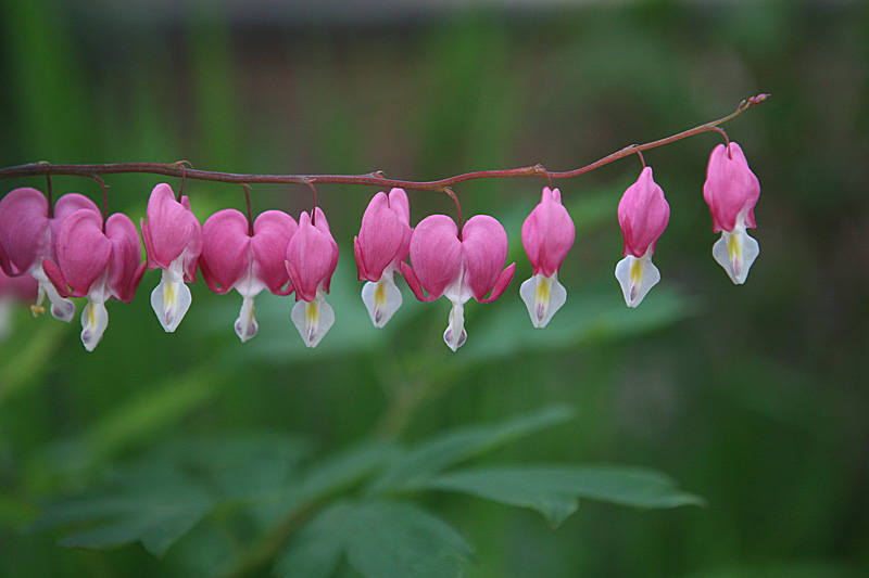
Bleeding heart detail

As promised, here's my choice for the best couple of blossoms from yesterday's bleeding heart photo, close cropped (notice the "rule of thirds" at work here), with a bit of Photoshop action on the far right to remove the edge of another blossom that was showing. (I didn't want to simply crop it out because it would have made that edge too close to the subject.) The clone stamp tool and spot healing brush are amazing! With all my talk of Photoshop, I need to emphasize that you've got to begin with a good image and have some skill and a good artistic eye in order to use the software successfully. Photoshop is not the idiot's way to make a bad photograph good.

This is an image I'd consider using for a card, maybe for Valentine's Day, though I'm not sure whether that might give the wrong impression (bleeding heart = broken heart?).

23 November 2006

Bleeding heart

As I was saying yesterday, I like repeating patterns or shapes. This time it's from nature, in a bleeding heart (Dicentra spectabilis) that I came across on the campus of Seattle Pacific University this past May when I was there for a meeting. You never know when you might see something of such exquisite beauty. So it's always a good idea to bring your camera everywhere.

I used a wide aperture, namely f/4, for a narrow depth of field (the smaller the "f-number" the larger the opening and the smaller the depth of field), otherwise known as "selective focus" -- to throw the background out of focus and draw attention to the flowers. Even so, that one leaf at the bottom is too close to the focal plane of the bleeding hearts, so it isn't blurry enough and is a bit of a distraction. Using a blur filter in Photoshop on that section of the image is one solution. But I chose a different one for my final image, which you'll just have to wait until tomorrow to see.

22 November 2006

Experimenting with avant garde photography

OK, this is really wonky, but I just wanted to try something surreal to see how I liked it. And it was a way to learn another technique in Photoshop.

I don't normally do still lifes, unless the main element is repeated patterns, which the superimposed image qualifies as. I shot this setup of a bunch of safety pins this evening, thinking I might do something interesting with it and then title it "Safety in Numbers." The fun part was selecting just the safety pins and none of the background, turning that into a mask, making the background transparent, thus making the photo mergable into any other photo I chose. But what photo to blend it with? I figured one of another herd of "somethings" that might be seen as attacking the safety pins might do the trick, so I pulled up this one from my trip to New Zealand last fall. Yes, while I was driving down the road (on the left side, you'll notice -- they drive on the "wrong" side of the road down there, to us North Americans), a herd of cattle came right at me and stopped me in my path. I had my camera handy on the passenger's seat next to me, because there were so many things I wanted to stop for and hop out of the car to photograph. This one just had to be done from inside the car, though.

Safety pin silliness aside, the main picture here is another example of one of my favorite genres of photography, which is the humorous justaposition (the "Jesus of the Hoops" from last week was another example). I'm talking about natural juxtaposition, not doctored up in Photoshop. Things I come across which make me laugh, and which I hope bring a smile to the face of the viewer. You'll be seeing more of those here in the coming days. As well as more of my nature shots, etc.

So what's my verdict on whether I like surreal photography? I need more practice if it's going to be successful, and I probably need to study the genre some. It's never been a genre I've appreciated looking at, so why I ever tried it is beyond me. Well, I guess the medium is the message, as Marshall McLuhan said, and Neil Postman latched onto. In other words, a medium shapes what we communicate with it. Because I could do this in Photoshop, I wanted to try. Not necessarily a good reason to keep doing it. I could wax philosophical about technology and whether we should do things just because we can, but I'll stop there. What do you think -- about the photo, surreal art/photography in general, and this philosophical question? I know I've picked up a couple of additional readers lately, so I'd love to hear your comments.

16 November 2006

Roadside Jesus Art in New Mexico

We're departing from the theme of autumn leaves for the time being. Today's photo is one I took on my trip to New Mexico in early August. We just don't get that kind of public piety up here in the Pacific Northwest, apart from a few white cross shrines near the side of the road where people were killed in car accidents. This "Jesus of the Hoops," as I call it, is somewhat tacky at one level, but there's also something beautiful about it. The basketball hoop is like a second halo, echoing the yellow painted halo and the shape of the crown of thorns, which is in turn repeated in the stack of old tires. This is an everyday Jesus. He's there in the midst of the sweltering heat, while you shoot hoops behind the garage, carry a load in your wheelbarrow, work on your beater van with the missing bench seat. And yet he's somehow otherworldly, painted with saintly aspect, eyes averted, blood trickling down his face, shoulders and chest. You probably can't see it in the low-res version of this picture, but the painter signed his work with his initials and the date: "** - 77" (the initials had been blacked out; perhaps he was embarrassed by his work or wanted it to remain anonymous). This isn't art photography per se as much as it is a photograph of art. But I've taken it in an artistic way, framing it to emphasize the jarring juxtaposition of Jesus and junk, and the repeating halo shapes.

It was a very bright day, so parts of this photo are washed out (overexposed). Nothing Photoshop could do about that. One of these days I'll get on the ball and do some HDR (high dynamic range) photography, where you take two different exposures of the same photo (using a tripod of course, to keep the composition exactly the same), one properly exposed for the shadows and one for the highlights, and then, using some fancy selection and masking and layers work in Photoshop, you merge the shadows of the former with the highlight areas of the latter for a perfectly exposed photo from bright to dark. No camera has the breadth of dynamic range that the human eye has, but with the magic of technology, you can make it look like it does. This process can be quite time consuming, but the results are stunning.

15 November 2006

Leaf pattern detail

Here's a closer look at those interesting patterns on the leaf from yesterday. One friend suggested they might be some kind of blight or disease, but I'm not so sure. Given the time of year (leaves are turning brown anyway) I think it's probably just that the leaf was dying from the inside out. I did find another one with a similar pattern on the ground the next day. This photo was taken with a +4 diopter macro filter at f/16 and 6 seconds, with a tripod of course. Even so, the edges are a bit blurry. A macro filter is essentially magnifying glass, and it distorts things around the edges. So it's nearly impossible to have the entire image in focus. Unless you crop out the fuzzy bits. Still, I kind of like the dreamy quality to this photo. Again, no color adjustments at all. What a brilliant red-orange leaf!

I have saved the leaf, pressed between two pieces of wax paper under a phone book. That's what the lady at the copy center suggested when I brought it in to them yesterday to have it laminated. She said she'd tried that with a leaf she found, and it rotted. So she recommended that I let it fully dry out before laminating it. I hope it doesn't lose some of its color in the next day or so while it dries.


Photography Directory by PhotoLinks