Showing posts with label Photoshop. Show all posts

05 April 2011

Edge Effects

I recently discovered a cool cache of useful Photoshop actions (free to download; donation requested; do give; I did) at The Light's Right Studio. I’ve been playing around with the TLR Edge Effects set and liking them.

You have to run one of the Create Unframed Edge actions first before you can run one of the edge effect actions, with the exception of Gaussian Blur Frame which requires one of the Create Framed Edge actions to be run first. Took me a while to figure that out, but now it’s awesome. My favorites are Gaussian Blur Edge, Frosted Glass Edge, Spatter Edge, and Sprayed Strokes Edge.

Here's what the image looked like:


And here's what it looked like after applying Create Unframed Edge and Gaussian Blur Edge actions (4 clicks):


You'll have to try it out yourself to see some of the others. There are a couple dozen different sets of actions, and I've only had time to play with one of them so far. Go to http://www.thelightsrightstudio.com/photoshop-tools.htm. And if you like them, do give a donation to support Glenn Mitchell's creative work.

14 July 2008

Life mimics art

I was working on a film shoot for the past couple of weekends, doing the production stills photography. At one point, someone noticed the resemblance between one of the lighting guys and a painting on the wall in the home where we were shooting, so I shot this photo of him posing beside it. Jean-Sebastien wanted the make-up artist to do him up in green and blue like the painting, but she never got around to it (or was joking when she promised to do it for him). So I took care of it in Photoshop.

24 January 2008

Color restorations, continued

A friend suggested that I consider just making these old slides black & white instead of trying to restore the color to an original I can never be sure of. So here's that same photo again, completely desaturated. It should would save time to do it this way, and I like the result. But there is also something to be said for the color restoration (imperfect as it is).

18 January 2008

Color restorations

Just wanted to show you the before and after on the color corrections for one of the slides I've been restoring. Here it is after I've touched up all the dust specks and scratches but before any color corrections:

And here it is after the color restoration:


Amazing what you can do in Photoshop, eh? I did this using Color Balance (sky) and Hue/Saturation (everything else).

17 January 2008

Scanning and restoring old slides

I have a big project I've been working on in dribs and drabs, and that's to scan a whole heap of slides that my grandfather took back in the 1930s and 40s, get rid of scratches and dust specks, and restore them to their intended colors. Most of them were taken on a Kodak Bantam Special on 828 slide film. It's hard to find anyone who will scan that stuff anymore these days, since it is larger than the standard dimensions of 35mm film (28x40mm as opposed to 24x36mm) and doesn't fit slide scanners. I bought the top of the line, a Nikon Super Coolscan 9000, thinking that would allow me to do them at home, but even that doesn't have a large enough opening in its slide holder. So I'll have to try to rig something up with one of its larger transparency holders, or else do them on my Epson 4870 flatbed scanner in transparency mode and manually crop them to the right size and rotate them slightly if I didn't get the orientation lined up just perfectly with no tray to hold them in (and that won't be ideal, because the focal distance of the scanning beam will be slightly off). For now I'm working on the few 33mm slides that are in the collection.

It's a labor of love, I tell you. It takes nearly an hour to do each one if there is a lot of color distortion and hundreds of noticeable specks. Photoshop can do a pretty good job of dust and scratch removal on sky, but on other things it sometimes adds too much blur which I don't like. So I'm going through and doing them all painstakingly with the spot healing brush tool. Even though it is time-consuming, I'm quite pleased with the results. Here are two of the ones I've done so far. One is my grandfather with his uncle and the other is his wife, my grandmother, with her aunt-in-law (the wife of my grandfather's uncle), with my dad as a little boy in the background. I love how vivid the reds still are in the flowers (I really didn't have to restore that at all) against the still somewhat muted rest of the photo of the women. Did their dresses have more blue or green in them? I can't tell. I got the skin and hair and grass colors looking right, and that's about all I can hope for. I have chosen to keep the slide mount backgrounds on, to reveal the origin of these photos.

20 October 2007

[Italy trip] Conventional conventical technology

I liked this wooden cart which I saw on the grounds of Villa Agape where we stayed in Florence, which is run by the Sisters of "Stabilite nella Carità" (stability in charity). Simple technology, elegant and rustic at the same time. Interesting shapes and textures. I did quite a bit of Photoshopping on this, as there were some distracting blotches of lighter color on the handle near the rusty metal joint which immediately drew one's focus and ruined the composition (in my opinion). I think I did a pretty good job of cloning the wood grain where those spots had been, in a way that doesn't look faked. This is Photoshop at its best -- used to fix something which was not a photographer's error, yet without violating the true nature of the original subject. (That gives a lot of latitude, by the way, to adjust colors, etc. And there is always validity in creatively changing the subject. So don't quote that line back at me if you see something more wild in my use of Photoshop in the future.)

27 June 2007

Adobe Bridge hack for Windows Geeks

This will be a yawner for all you photographers who are switching or have switched to Mac (or have been using Mac all along). But if you're still a Windows user, and you use Adobe Bridge, and you're even remotely tempted by Geekdom, read on...

I'm tired of the experience of having a folder open in Windows Explorer, wanting to view it in Adobe Bridge, starting Bridge, and then having to navigate in Bridge to the folder I already had open in Windows Explorer. I've been wanting a way to open "this folder that I'm looking at right now" in Bridge. I was hoping for a right-click menu option or something. It didn't exist. So I figured out how to create it. ALL CAUTIONS ABOUT MESSING AROUND WITH SYSTEM STUFF APPLY HERE: Make a backup of your registry, don't attempt this unless you sort of know what you're doing, etc. [Yeah, you Mac folks are probably giggling right about now if you're still reading... ;-)]

1. Run regedit.exe
2. Navigate to "My Computer\HKEY_CLASSES_ROOT\Folder\shell" and select "shell"
3. Edit > New > Key
4. Name it Open with Adobe Bridge
5. Make sure this new key is selected
6. Edit > New > Key (again)
7. Name it command
8. With this key selected, double-click on the (Default) value in the righthand pane.
9. For Value Data, put in the full path to where your Bridge executable is stored (in quotation marks if there are spaces in it), followed by "%1" (with the quotation marks); for example, on my machine (which has the default installation of Adobe Creative Suite), I put:
"C:\Program Files\Adobe\Adobe Bridge\Bridge.exe" "%1"
10. Exit regedit.

Now you can right-click on a Folder icon anywhere in Windows Explorer, and there will be a new menu item on the pop-up menu: Open with Adobe Bridge. Select this, and Bob's your uncle.

22 May 2007

When is a photo no longer a photo but a painting?

I created this image starting from a photograph I took of six bride's maids dressed in colorful dresses getting ready for a wedding. It was a lovely photo to begin with, but I wanted to experiment with the qualities of the colors and obscure the naturalism quite significantly to make it more impressionistic. I applied a generous amount of manipulation in Photoshop using the Art History Brush tool, and this is what I settled on as my final result. The feeling of using the Art History Brush on a blank layer which is superimposed over the original image is really very much like painting with a brush on a blank canvas. Though I'm not adept at using real brushes and paint, I am learning to reproduce a similar effect in Photoshop. So my question is this: when does a photo cease being a photo and become a painting? This looks more like a painting to me than it does like a photo. Of course it's not a "real" painting, it's a digital one. But I still think it's a painting. However, it's also a photo, since all the colors came originally from an image made on a camera. The texture and a certain degree of where the boundaries fall between color patches come from my brush strokes.

20 May 2007

"Getting into Pictures" in Photoshop (5 part tutorial)

Here, for the sake of convenience, is a link to all five parts of the tutorial on "Getting into Pictures" in Photoshop -- how to make realistic looking composite images in Photoshop where you put yourself (or someone you know) into a famous work of art (or another photograph):

Part 1
Part 2
Part 3
Part 4
Part 5

18 May 2007

"Getting into Pictures" in Photoshop, Pt. 5 (final)

This is Part 5 of a 5-part series.

Today we are going to fix up the skin color and the noticeable edges. For the color adjustment, we will add an adjustment layer. Make sure the face layer is active (sometimes called "targeted" in Photoshop lingo) in the Layers palette. Now choose Layer > New Adjustment Layer > Color Balance. Turn on the checkbox "Use Previous Layer to Create Clipping Mask" -- this will make sure that the adjustment applies only to the face. Click OK. Play around with the sliders for the Cyan-Red, Magenta-Green, and Yellow-Blue axes until you get the color you want, and then click OK. (You might also be able to get the color adjustment you want using any of several of the other adjustment layer types, for example Hue/Saturation, Curves, or Selective Color. One of the frustrating things about learning Photoshop is that there are often multiple different ways of doing the same thing. Just play around with these other adjustments to get used to what they can do. I found the color adjustment I wanted on Jane's face using Color Balance with the color levels set to +8, +6, and -53, respectively.

Now I complete the transformation of Jane's hair into Mona Lisa's hair. A bit more tweaking of the mask first. But...oops! Mona Lisa's forehead is higher than Jane's so her face shows through where I've removed Jane's hair in some spot. This is a job for the Clone Stamp tool (). This time we need to first make sure the background (Mona Lisa) layer is targeted. Select a reasonable brush size that's smaller than the area you're going to be working with, and has soft edges. To use the clone stamp tool, select it from the Tools palette. Now choose a spot that you want to clone from, move the mouse over it, and hold down the Alt key while you click. Then click on a destination spot that you want to clone that source to. Think of it as sort of a copy/paste. You'll want to keep picking a new source area each time you clone, in order to keep the cloned area from looking too obviously like a duplicate of a nearby area in the painting.

To fix the abrupt transition between Jane's neck and Mona Lisa's, I used a combination of tweaking the layer mask, clone stamp tool on both layers, and the Smudge Tool (; to find this tool, click and hold on the Blur Tool ( and select from the dropdown menu). The Smudge Tool does just what it name sounds like. You click and drag on an area of the image, and it sort of "smudges" the pixels from the place where you started dragging into the place where you released the mouse. Go back and forth to get just the blending you want between the two sides of the boundary.

Finally, you can use Image > Trim or the crop tool () to remove any extraneous canvas area. With the crop tool, simply click and drag out a rectangle to indicate the area you want to crop to, and press Enter to commit the changes.

As a finishing touch, I've now added this frame (one of the many Filters available from Alien Skin Software's Splat! [UPDATE: no longer available]). And here is the final result:


The End!

16 May 2007

Iris

I love irises. They are probably about my favorite flower. There are all kinds of symbolic and theological reasons I like them (three petals like the Trinity, purple a royal color, Iris in Greek mythology, etc.), but the bottom line is they are just plain beautiful, and I love purple. Here's a photo I took of an iris down in New Zealand which I've Photoshopped a bit to simplify and colorize the background. If you think that's cheating, then so is painting. I'm just using different tools to create the look I want.

12 May 2007

"Getting into Pictures" in Photoshop, Pt. 4

This is Part 4 of a 5-part series.

The next step is to fine-tune the matchup between Jane's face and Mona Lisa's hair. We'll do this using two new techniques. Free Transform, to resize and reposition the face. And adjusting the opacity of the top layer temporarily, so we can see through to the background for precision in positioning. We'll finish painting the layer mask once we've got the face in exactly the right place and know what bits to mask out.

So, make sure that the top layer (Jane) is active by clicking on it in the Layers palette. Then select Edit > Free Transform. You now see a sizing rectangle with "handles" on it that you can do all kinds of transformations with. The three we'll use are:

1) rotation - position the mouse anywhere outside of the rectangle, and the pointer becomes a double-headed arrow which you can drag in a rotational direction to turn the layer image about its center point; you can drag that center point around if you want to move the point of rotation to somewhere else
2) scaling - drag from one of the corner handles to make the image smaller or larger; make sure you hold down the Shift key while doing this, as that will maintain the aspect ratio and prevent distortion
3) moving - click anywhere inside the rectangle (except on the center point) and drag to reposition the image

Once you have done all the rotating, scaling, and moving that you want, press Enter or click the checkmark icon (the Commit button) on the options toolbar to commit these changes.

Using those three techniques, now do the best you can to position the face over the background and make it match the size of the place where it's going to fit in. If you mess up at any point along the way, you can undo one step of the changes by presing Ctrl+Z or cancel out of them entirely by pressing Escape.

If you find that scaling the face larger makes its resolution too poor, you can alternatively resize the background layer smaller to fit, using the same method. You might need to zoom out using Ctrl+0 to be able to see the sizing handles in this case.

In positioning the face, you might find that you can't see the background well enough to get the position exactly right, because too much of it is obscured with the stuff surrounding the face in the top layer which you haven't masked out yet. It's kind of a Catch-22. You don't know what to mask out until you've got it positioned right. Here is where adjusting the opacity comes into play.

At the top of the Layers palette are a bunch of controls, including Opacity (set to 100% by default). With the face layer selected, click the dropdown arrow next to Opacity, and drag the slider to somewhere much lower, perhaps 20 to 50%, whatever works best for you given the colors of the images you're working with, so that you can still see enough of the top layer to work with it, but enough of the background to position the face accurately.

When you go back to working on the mask, set the opacity back to 100%. You might need to iterate back and forth between these two stages a couple of times to get everything just right. As I mentioned in an earlier lesson, set the brush to a smaller diameter and its hardness down to 0% when doing the precision mask work near the edges of where the face will finally meet up with its background. And zoom in to a greater magnification (Ctrl++) so you can see what you're doing.

I tried to get the proportions of Jane's features to match those of Mona Lisa (impossible to do it perfectly since ML's chin is so small). And I lined up her cheek line and neck, not worrying too much about the hair line. Then I masked out the rest of the background. The images in this post show where I've gotten so far, in two intermediate stages -- first with opacity of the face layer set to 70% after I'd positioned the face, but before I'd finished painting the mask, and the second back at 100% after masking.

All we have left to do now is fix up Jane's skin tone to match the painting, and do a better job of blending the hair and the place where their necks join. That's for next time.

Go on to Part 5.

04 May 2007

"Getting into Pictures" in Photoshop, Pt. 3

This is Part 3 of a 5-part series.

Today I'm going to show you how to clear away the unwanted background around the face in the photograph. To do this, you'll need to know the basics about layer masks. Normally, a layer completely obscures any layers that are beneath it (the stacking order is the order shown in the layer palette). So where we left off yesterday, the photo of Jane covers over the part of Mona Lisa that is beneath it. But Photoshop allows you to associate an optional "mask" with each layer. This mask indicates which regions of the layer will be transparent (showing through the content of the next layer below) and which will be opaque. A layer's mask is black & white, and is the same dimensions as the layer. Wherever there is white in the mask, the layer is opaque there, and wherever there is black in the mask, the layer is transparent. You can also think of painting black into the mask as "erasing" the content of the layer in those places so that the background shows through. But it's a non-destructive kind of erasing, because the layer image is still there.

Now let's create the layer mask. In the Layers palette, click to select the top layer which is the photograph ("Jane" in my example). Note: don't click on the "eye" icon beside the layer, as this will turn off/on visibility of the layer, but click on the thumbnail or text label of the layer. Now choose Layer > Layer Mask > Reveal All (or click on the "Add layer mask" icon () at the bottom of the Layers palette). This creates a default mask that is all white. You'll see its thumbnail show up next to the layer thumbnail. Now be sure the layer mask thumbnail is the one that's active (there should be thicker lines around the four corners of it), as opposed to the layer thumbnail. This is a very subtle difference, but it's important, as it will ensure that you're painting only in the mask and not obliterating the image in the layer itself. The mask will be selected by default when you first create it, but get in the habit of verifying that the right item is active whenever you're about to paint in a layer or its mask. To activate one or the other, just click in the corresponding thumbnail.

Now we're going to select the eraser tool () to paint black onto the areas we want transparent. You could use the brush tool () with black as your foreground color if you prefer, but it's equivalent to selecting the eraser tool with black as your background color. For now, let's use the eraser tool.

To set foreground or background color, normally you'd click on the top or bottom swatch of color (foreground and background, respectively) in the color selection area of the Tools palette: , and the Color Picker would come up. But for setting the colors for a mask, there's a quicker way. Simply click on the tiny icon of overlapping squares in the lower left of the color selection area in the Tools palette. This sets the foreground and background colors to their default settings, which for masks is always white and black, respectively. (It's the opposite for painting in layers.)

We'll also need to select an appropriate brush size to give us precise control over painting. (Even when working with the eraser tool, we still use the metaphor of painting, and have access to all of Photoshop's rich brush options.) We'll start with a large brush to paint (erase) the large areas of the mask roughly, but then we'll go down to a smaller brush for more precision in the details near the face. To select the brush size, click the Brush dropdown (the little triangle to the right of "Brush:") on the Options bar at the top of the Photoshop window. Choose the largest round brush you see there (it'll probably be 19 pixels), and then drag the Master Diameter slider over to the right to, say, 100 pixels. Keep the hardness at 100% for now. To make the dropdown go away, click anywhere outside it.

Now the fun begins. Just start painting (clicking and dragging the mouse) all over the background of the photograph where you want to erase it. When you start getting close to the face, you can reduce the size of the brush by hitting the left bracket key ([) multiple times. If you need to zoom in to be able to see the details better, you can press Ctrl-+ (Ctrl and the plus key) as many times as you need to (and use the scroll bars to go to the section that you want to focus on). Ctrl-- (minus) zooms you back out. Ctrl+0 (zero) zooms out to exactly the right size for showing the entire image. If you erase too much by mistake, don't worry. You can always paint white back over the areas where you goofed, by exchanging foreground and background colors (click the double-headed arrow near the color swatches, or press the X key).

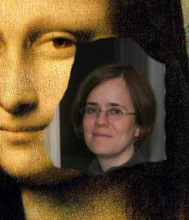
Don't get too detailed with masking around the face just yet, because we'll need to position the face better over the painting in order to see exactly what parts need to be erased. I'll leave you hanging on that until next time... In the meantime, save your work! Here's a detail of what mine looks like so far:

Go on to Part 4.

03 May 2007

"Getting into Pictures" in Photoshop, Pt. 2

This is Part 2 of a 5-part series.

The next step is to get the two pictures together into one Photoshop (.PSD) file in two different layers, in order to be able to work with them. To do that, open both files (which you presumably have in JPG format) in Photoshop. I like to use the image that's going to form the background as the "working file" so we're going to drag the other image into it as follows: Position the windows so that you can see them both next to each other. Select the "Move" tool () in the upper right corner of the Tools palette. Click on the photo of the person you know, drag it into the image of the artwork background, and release the mouse button. Now immediately do File > Save As, and give it a new name, to save it as a PSD file and avoid accidentally overwriting the original artwork.

You now have a Photoshop file with two layers. Double-click on "Layer 1" in the Layers palette (which you can show via the Window menu if it isn't currently visible), and rename it something sensible, such as the name of the person whose photo it is (I'll call mine "Jane"). Double-click on "Background" in the layer right below that and the "New Layer" dialog will come up. Give it the name of the painting (in this case, I'll call mine "Mona Lisa"), and click OK. What this does, in addition to renaming the background, is it also unlocks that layer and makes it fully editable. Notice that the little lock icon disappeared to the right of the layer name after you OKed the "New Layer" dialog.

Don't worry for now if the relative sizes of the images are way out of whack. We'll fix that in the next lesson. But I am going to do one more step here, and that's flip the image of Jane around the right way so that it will begin to match better the orientation of Mona Lisa's face. To do that, click in the Jane layer to select it, so that it's one that any subsequent layer-specific commands will apply to. Now choose Edit > Transform > Flip Horizontal. Save again, and we'll come back for more next time.

To the right is what I've got so far, and here's what my Layers palette looks like:


Go on to Part 3.

26 April 2007

"Getting into Pictures" in Photoshop, Pt. 1

Here begins a multi-part tutorial on how to make realistic looking composite images in Photoshop where you put yourself (or someone you know) into a famous work of art.

[Note: I'm aiming this tutorial at beginner Photoshop users, hence some of the pedantic explanations, but I'm not going to attempt to explain everything about all the features of Photoshop that I'm introducing you to in these pages. There are reams of Photoshop tutorials available on the web. I'm just getting you up and going quickly, and you can read more about it later elsewhere if you want to. Hopefully someday I'll be writing my own longer tutorials like what you can find out there, only better :-) But I've found that the best way to learn Photoshop was to get my feet wet even though I was overwhelmed by everything and didn't fully understand it yet. I'd just put a "place marker" in my brain for "layers" or "masks" or whatever feature I didn't have a clue about, and say to myself or to the tutorial, "yeah, I'll come back later and learn what layers are, but for now I'll just take your word for it and do what you say."]

Start by finding a good clear photo of the person and a piece of art in the public domain that will work together. Most importantly, the angle of the face towards the camera needs to match that of the person in the painting that you'll be replacing. If you're just putting someone into a generic scene with no people already in it, the pose isn't so important.

Remember, you can always flip the person horizontally, rotate the image, and scale it up or down, so size and orientation don't matter. And of course colors don't need to match, and don't worry about whatever extraneous stuff is in the background of the photo. We'll fix all of that up later.

Start with the highest resolution version of the art work you can find online (or scan from a book at home). If it's for on-screen use only, you can get away with a smaller image, but if it's for print, you'll need more resolution. You can find works of art on the Internet using Google Images.

Here are the two images I started with for my "Mona Jane" picture. Notice that Jane's face is turned slightly away from straight on towards the camera, just about the same angle as Mona Lisa, though in the opposite direction. I knew I could flip it horizontally, so I figured it was a good fit. The Mona Lisa image is 155K and Jane is 38K, though I will only be using Jane's face, so I have way fewer pixels to work with for her -- not ideal. The resolution of the result won't be great, but I plan to use this only on screen, so it will be sufficient. (In retrospect, I probably should have gone back to the original photo I took of Jane, not this reduced resolution version I had made for emailing to her. But I'm learning such things as I go.)

Feel free, for the purposes of this tutorial, to download these images I'm using, and then you can follow along with me. For each one, click to view the full-sized version of it, and then right click on it choose "Save Picture As" and save it to a file on your hard disk.

Go on to Part 2.

14 April 2007

More photoshop fun

Here's that "interesting old dilapidated farmhouse" I mentioned in my last post. The photo I'd taken of it seemed pretty good to me at first glance (apart from the vignetting in the upper right corner), even after having stared at it for a long time. But that was before I "met" Julianne Kost. I've been watching her DVD tutorials on Photoshop, and I had no idea how much better you could make an already pretty good photo. Today I learned how to fix lens distortion and change perspective. I wasn't even able to recognize lens distortion before I watched this video. After watching it, the distortion jumped right out at me in my original image. The photo was taken with a 24mm lens, which is a somewhat wide angle. The wider the angle, the more distortion (towards the "fish-eye" look of ultra-wide angle lenses) you will get. It's barely perceptible at 24mm unless you know what you're looking for. You might have to click the image to see an enlarged version to be able to see it. Notice how the rusty post to the right is sort of bowed as it bulges out towards you away from the center of the photo? That's lens distortion...well, one kind anyway.


Now look at the photo again after I did some touching up in Photoshop. The post is straight. The perspective on the house looks a bit more natural (not all of that tilt in it before was due to the fact that the house really is collapsing!). I also got rid of the "vignetting" (the darkening in the corners) which is another lens artifact. I probably had too many filters on my lens, and the wide angle lens will pick up a bit of the black rim of the filters in that case. Normally your camera will correct for the fact that the lens opening is round and the frame is rectangular, but in some situations it's not perfect.

I don't know what it is about falling apart buildings, but I really like to photograph them. See this other one I did.

02 February 2007

Gannet in flight

I'm waiting for the ID of another New Zealand flower photo I wanted to post tonight, so instead I'll go back to gannets. I will let you in on a little secret. The sky was totally grey and boring on the day I shot this. So the sky in this photo is painted in with Photoshop using the gradient tool. Not bad, eh? You'd be hard-pressed to find any artifacts from the editing. I used the smudge tool to touch up the edges where the sky met the bird in a couple of places where it was obvious (where the bird's color contrasted least with the sky color, i.e., around his tail and at the back of his head/neck).

My photographer friend Paul Butzi says you can learn about the world through doing photography, and that's one of the main reasons he does photography. I learned some things about gannets by photographing them that day at Muriwai Beach, though to really learn more about them, I'd need to spend days around them photographing them. And I also think one needs to supplement the photography with something else, some sort of research into what other people have learned about them and how they have classified them. For example, I'd really like to know what those white feathers are called at the trailing edge of his wings, near the root of the wing (inside where the black feathers start). I'm sure there's a name for them. There seems to be a name for everything biological. I wanted to describe to you how that was one of the edge spots that I edited with Photoshop, but I didn't know the word to use. I could look it up in one of my birding books, but they are all still packed away from my move. If anyone happens to know the word, please post it here in the comments. I did a quick search in Google, but this chart I found doesn't seem to give me the answer that I think must exist.

23 January 2007

Panoramania!

Rivendell PanoramaSmall detour from the New Zealand series, as I just have to share something fun with you today. I recently purchased a really cool program called PanoramaPlus 3. It automatically stitches together a panorama out of multiple photos of a subject, even if they are not perfectly aligned. (It uses software technology called autostitch that was developed at UBC. While PanoramaPlus is a commercial product, Autostich is free, if you want to try out the barebones tool to see if you like it.)

I spent this past weekend at Rivendell retreat center on Bowen Island, which gave me a perfect opportunity to take a bunch of pictures of an expansive view to make into a panorama. This photo is the result of running five photos (taken to roughly cover the whole view, with some overlap) through PanoramaPlus. I then did some touching up of the sky in Photoshop to fix artifacts from the multiple perspectives on the roof-line that were left marring the sky in the stitched-together result. Everything else was perfectly seamless!

Who needs to lug around a view camera when you can do this?

11 December 2006

Balloon flower (platycodon grandiflorum)

Just another pretty flower picture today. (From my archives, obviously. Spring does come early in Vancouver, but not this early.)

There are some photographers who consider themselves to have "moved beyond the pretty picture" (see, for example, The Landscapist blog). While I am learning to use my photography to communicate (an idea or emotion), to reveal a subject in a new way, or to accomplish something (raising awareness and money for nature conservation, for example), I don't see how I could ever abandon photos that "merely" showcase the beauty of God's creation. It is still a challenge to make them good. And people never tire of looking at them.

This gem was growing at Van Dusen Botanical Garden in Vancouver. I shot it back in 2002 on my old Yashica 230-AF, using color slide film: Fujichrome Velvia 50, known for its saturated colors and ultra-fine grain. I used both a macro filter and a warming filter, and a mini-tripod if I recall. I remember having to lie down on the ground and mess around with the tripod and camera and a reflector for quite a while to get the composition and lighting right. Scanned at 300dpi and touched up dust spots in Photoshop afterwards.

09 December 2006

Photographing art

Here's a photo I took recently of a wood carving I did last year of a dolphin. I used it to learn how to remove the background of an image in Photoshop -- a very useful technique which I applied to the safety pins in my "Safety in Numbers" photo. It was much trickier in that image, because of all the tiny places with background showing through between the metal bits.

One has to be careful in claiming artistic ownership of a photograph of another work of art (unless it shows that work in a new and creative way). I love photographing stained glass windows, for example, but mostly only as a document of what I've seen, since the real artist was the stained glass worker. In this case, though, since I was the artist who created the wood carving, I'm not plagiarizing. But it remains only a documentary photo, not a work of art in its own right.

Still, photographs of art, when authorized, can be a great way of making that art accessible to others. Thank goodness for good quality photographic reproductions of museum art all over the world, which otherwise would be available only to those who could afford to travel to Paris, London, Berlin, etc. My friend Bruce Jeffrey, a professional photographer in Vancouver, has done some stunning photos of the frescoes and sculptures of Benedictine monk Father Dunstan Massey, most of which are hidden away in the monks' private quarters in Westminster Abbey, in Mission, BC. The general public never gets to see this stuff, but it is amazing work. And Bruce's high quality reproductions allowed it to come out of the cloister and into the art gallery.


Photography Directory by PhotoLinks